WEB4PRO Has Released A New Google Shopping Feed Module For Magento 2 And Became Adobe Solution Bronze Partner
WEB4PRO has released a Google shopping feed module for Magento 2, this module is designed to export goods from eCommerce sites to Google Merchant Center.

Google Shopping Feed by WEB4PRO
Google Merchant Center is a platform where an online store owner uploads data about available products. Users directly from Google search receive important information about products: image, name, price, seller, rating, and so on. Here is an example of the GMC feed that we get for the request “men’s jacket buy”.

Our module automatically generates an XML file with the necessary data (titles, links, images, price, etc.) for the Google Merchant Center, which makes it easy to transfer a large number of products from a Magento store to Google, and saves you a huge amount of time.
If you find this product useful, feel free to check it on Magento Marketplace.
WEB4PRO is Adobe Solution Bronze Partner
And one more good news! WEB4PRO has officially received the status of an Adobe Solution Bronze Partner.

The Bronze Partner award is an opportunity to create innovative commercial solutions, as well as access to special resources, Adobe services (such as Magento), materials and tools designed to increase sales and promotion.
Let’s take a look at the benefits of becoming an Adobe Bronze Solutions Partner
- Sandboxes and non-production software licenses
- Participation in pre-release and/or betas
- Access to Adobe Demo Hub
And these are not all the benefits that you can get with this affiliate program.
Our inclusion in this program means that we are officially recognized as part of Adobe’s Accredited Developer Companies, and we correspond with all requirements.
NFT in eCommerce: It’s Not as Difficult as You Think
Cryptocurrencies and NFTs are attracting increasing interest from consumers and companies. Brands are starting to think about how they can be part of this trend and how they can take advantage of the NFTs. Even global fashion brands have begun to create their own digital NFT fashion collections to attract new customers.
NFT mobility has become a valuable business resource, and companies have started to have many more opportunities due to eCommerce platforms with NFTs. Nearly $41 billion worth of cryptocurrency was spent on NFT marketplaces in 2021. The most valuable NFT is worth over $91.8 million.
The idea of NFT is tricky to comprehend, but technology has limitless potential in today’s world. The companies started to have much more beneficial opportunities due to the eCommerce industry with NFT.
First, let’s figure out what NFT is and how Non-Fungible Tokens (NFT) and eCommerce platforms can access the global market by using NFT.
What Is NFT Token?
NFT stands for “Non-Fungible Token”. A non-Fungible token is a cryptographically recorded ownership of a unique object. In order to identify the original copy, a digital file can be stored as an NFT. It can be anything: a video, a song, an artwork, a photo of your cat, some memes or a tweet.
NFT can be considered a modern collectable. You can buy and sell them online, often with cryptocurrencies, and the same software is generally used for encoding NFTs as is used for cryptocurrencies.
NFTs are like any other collectable items, such as artworks, but you are not physically buying them; you are just getting the digital file and the proof that you are now the owner of the original.
Here we are facing one of the most significant contradictions: how can you pay money for something that can be, in principle, downloaded for free when many NFTs are just “ownership” of an online image?
We can feel both admiration and scepticism towards NFT… What on earth can determine the value of an asset that is really just a digital token?
What Is NFT in eCommerce?
Usually, NFTs are sold on trading floors. As for NFT in eCommerce, a digital storefront is created by artists in order to sell their art.
For example:
An experiment in which real sneakers were sold paired with virtual ones was undertaken by Nike and their partner artists, FEWOCiOUS & RTFKT. It was hugely successful: more than 600 pairs/NFTs were sold in 6 minutes, bringing them about $3.1 million.

The limited-edition NFT “Into the Metaverse,” launched by Adidas, was even more profitable. The physical clothing and NFTs offered by the company sold out in a few hours, earning $22 million.

Robert Mondavi’s NFT is another good example of NFT in eCommerce. In order to promote their unique, authentic wine collection, a vineyard initiated this new digital asset.

Users of the Shopify eCommerce portal can offer NFTs directly on the site. For example, the Chicago Bulls created a collection of NBA championship rings in NFTs. This new form of merchandise was represented on Shopify eCommerce platform. They sold this collection of digital NFs in approximately 3 minutes.

One year ago, the world-famous brand Gucci announced a digital sneaker collection. The NFT environment created by Gucci allows their customers to buy and sell sneakers, as well as initiating the creation of their own digital NFT collections. NFT in eCommerce has become an inseparable part of this luxury fashion brand.

How to Sell NFT?
If you have decided to get started with NFTs, your first step will be to find a way to introduce NFTs to the world. You can consider two options: selling them through your own website or using the NFT marketplace. Which one to choose depends upon the level of control you would like to have over your payment and branding.
NFT Marketplaces
You can choose from a great variety of NFT marketplaces and NFT websites, focusing on a specific niche.
What are the top NFT Marketplaces out there?
NFT Launchpad is mostly recommended for traders and creators
Binance NFT Marketplace is an excellent trading platform
OpenSea is a great place to start and is leading in NFT sells
Axie Marketplace is an excellent NFT gaming platform
Nifty Gateway is an easy to use platform for buying/selling and storing art and collectable items digitally
Rarible is a good choice for musicians, artists and photographers
The list of market places mentioned above is indicative of the variety of NFT platforms, which have different features to choose from in order to accommodate your needs.
Corporate Websites
When you use your own website for selling NFTs, it allows you to control your brand, data and analytics and payment process, which is quite advantageous. However, there are some disadvantages: the complexity of the procedure and strict regulations will undoubtedly increase your efforts and the costs, while sales of NFTs are not supported by all payment systems – most of them only accept cryptocurrencies as a payment method.
Sell NFT on Shopify
Shopify offers users the chance to sell their NFTs through their storefronts. When we use Shopify to deal with NFTs, there are many advantages as compared with other NFT-focused marketplaces.

Shopify NFT marketplace provides help with:
- Finding the right payment option
- Creating a brand experience
- Embracing a wide range of clients
- Shopify platform integration with websites
To sell NFTs on Shopify, you must be a US store and have a Shopify Plus plan. This will enable you to join the Shopify NFT beta program.
After getting approval for your application, you can get NFTs from your Shopify store by paying with credit cards and cryptocurrencies.
If your Shopify store is located in another country, you can still apply for the NFT program. But you will need to connect with your payment provider, in order to pay for orders in your store.
What Can You Sell as NFTs in eCommerce?
In eCommerce, NFT can represent both physical and digital objects. We would like to draw your attention to some of the NFT ideas that can be sold:
Fashion Design Industry
If you are a famous international brand such as LV, Victoria’s Secret, Calvin Klein, Burberry, with a huge client pool, you have a new possibility: selling not only the physical product but also a digital version, as well in the form of NFT. In order to be profitable, you need confirmation that your clients will have an interest in the creation of digital collections for your brand.
Artworks
We all know that some online stores sell digital art prints. Like them, you can turn your artwork into a unique object, creating an NFT and selling it, for example, on Shopify.
Photography
Your photos can be turned into NFTs and sold online. Some photographers do the same by selling their photos in digital form.
Music
If you are a creator of musical compositions, you can convert them into NFT format and sell them online, if you wish. The only thing you have to be sure of is that they are unique and authentic.
Video
Videos can also be sold as NFTs. The same rules apply. Full rights to the video in question are required from you.
How Can an eCommerce Company Use NFT?
Give NFT as a Reward
For your eCommerce business to be prosperous and well developed, customer involvement is crucial. It is imperative to interact with your potential consumers by conducting surveys, beta tests, and discussing the prospects of your eCommerce business development so as to take into account their needs and wishes. To keep your customer happy, you can give them NFTs as a reward and thereby increase their engagement and strengthen your relationships.
NFT as a Loyalty Tool
NFTs can be used by merchants as part of a reward program for an eCommerce business, equivalent to a membership card. Thus, you can issue NFTs as verification of membership, voucher, or purchase. What’s more, due to the unique nature of NFTs, the reward for each NFT holder can be customised, such as discount conditions, events participation, early access to new products, and many others.
Sell Digital Goods
You can earn extra income by selling digital goods or using them to complement your physical goods. In the meantime, this will help eCommerce stores provide a unique experience for shoppers.
eCommerce Professionals: Interview with Co-Founders of Bee IT, Zoran Tovarloza and Nikola Gorjanac
Welcome to our series of inspiring interviews with eCommerce professionals. Today we are glad to have two amazing guests from Bee IT: Zoran Tovarloza, Co-Founder & CEO of Bee IT, and Nikola Gorjanac, Co-Founder & CTO of Bee IT.Bee IT is a Serbian software development company focused on creating high-quality eCommerce solutions for small to enterprise clients. They build automated online stores and work with advanced high-quality eCommerce platforms, such as Salesforce Commerce Cloud (Demandware) and Magento.
It was really interesting and exciting to learn about the way of such a successful company, discover what stands behind their team and values, and how Nikola and Zoran help their team grow and lead it to success. Enjoy our interview and pick up great ideas about leadership.
WEB4PRO: Zoran, Nikola, thank you for your interest in our project. We are happy to talk to you, learn your story and the story of Bee IT. Could you please tell us a bit more about your company, its way in eCommerce, and its story and strengths?
Zoran: I worked as a Java developer as soon as I finished University, and after thirteen years of development, I decided to start a company with my colleague Nikola. Bee IT is an eCommerce agency mostly focused on Salesforce Commerce Cloud and Magento development. Most of our clients are digital agencies and big brands from Western Europe.
Nikola: My background I also started somewhere ten years ago with development. I worked five years with Zoran in our previous company, and afterwards, we started our company. Bee IT is a fairly young company with really young individuals. We like to build our people, grow them with a company, and make developers from them as we want to see. In our theory, we are learning them with things that work, and we are training them completely from scratch if they’re fully juniors. We are not chasing a lot of seniors just because of that thing. I think our knowledge as a company is growing pretty fast because guys are catching up with development, communication, and project management.
WEB4PRO: It’s great that you create such conditions for people working in your company. You said that you also had a development background and worked in another company, and you were teammates, right?
Nikola: We’ve worked together for about five years in a previous company. Then we wanted to set sail and create something different. If you come to our office, you can see that we are working in a casual manner. There is no fixed policy and no kind of strict corporate culture. We don’t care how people come or how their clothing looks. We want to get them to be relaxed and don’t care about those things. Development can be somewhere stressful, so we don’t want to put those bordered standards to think about this, so leave those irrelevant things, come here, work as you wish, and give your best. That’s an idea.

WEB4PRO: That’s great. Free conditions and a friendly atmosphere account for a lot of productivity for the whole team. What inspired you to take this challenge to create your own business and grow the company during these years?
Nikola: I would say what you mention – challenge, actually. When you develop something, you have constant challenges. When you’re solving them, it’s a huge thrill. This is just the same thing in some other shape, so this is probably something that comes from development legacy. To overcome some situation, fix something, make something better, and improve it – I suppose that’s the main background.
Zoran: Yes, the challenge is the biggest driver, actually, to constant growth and happy clients and employees.
WEB4PRO: It really matters. I suppose you have great clients with interesting projects where you are fulfilling, but what is the most fulfilling part of your job? What makes you feel happy?
Nikola: It is always a challenge. At the company’s beginning, I worked on the project with different people. I’m currently also mentoring people, and I always looked at how projects were going and how projects were ending. I want to get everything to succeed, the same thing with colleagues. I want to see them grow as soon as possible to be full developers. They can work alone and don’t need anyone to mentor them. I am currently not involved in projects, but there are various things that I am still doing, so we are trying to be indirectly connected with all our developers. So we still want to give them wind in their sails, giving them good examples of how to solve some things, communicate with them, help them overcome their challenges, and learn how to do their work as best as possible. Soft skills are the hardest part for us. I think for all developers, Soft skills are a part to learn, that is something that we are trying to improve every day, and that is fulfilling when you see that someone is growing and becoming a better developer than you are. So one day overcome the master, I suppose, that’s the goal.
WEB4PRO: You’ve been together almost five years. Can you recall one of the most interesting projects or moments in your company life that you cherish and still like to remember in the team?
Zoran: For me, the start was most interesting. We were in small apartments, 6 of us. It was all new, and we had to learn a lot about managing. That was the most exciting time.
Nikola: I would say the same things when I recall all those night shifts. That was the most challenging, but I suppose the most revolving thing I did from this perspective.
WEB4PRO: Sounds really interesting! One of the most important things in your team is values and beliefs. What do you value most of all, personally and in your team in general?
Zoran: Three things: teamwork, open and honest communication and proactivity – in both: clients, employees.
Nikola: Yes, it’s also reliability and responsibility of people, when they are trying to pull their strings, launch their projects
WEB4PRO: Yeah, that’s important for the whole team who works on a project. And we, at our WEB4PRO company, also share the same values, such as open-mindedness, responsibility, honest communication, as only such principles help build trust between people. That’s great to feel like we are on the same wavelength! Thank you for sharing these personal and valuable things. Your company specializes in eCommerce, you are eCommerce professionals. Why did you choose this industry? Why eCommerce? Why not something other?
Zoran: We started with various technologies, after one year, we decided to specialize in the eCommerce industry. So our idea was to focus on one niche.
Nikola: If you go to the wild, you can export to anything, so we wanted to be experts in eCommerce. When we started, we saw that there were not so many eCommerce companies in Serbia, so we saw an opportunity: Everyone is working with, let’s say, React or any other development technology, but let’s go with eCommerce!”. We saw a lack of those things. And well, when CORONA hits the fan, I think, eCommerce exploded.

WEB4PRO: Many online businesses started or switched from offline to online because of this distance and lockdowns. What do you think will be trending in eCommerce in the future?
Nikola: For example, we can see a higher demand for progressive web apps. People want to see speed performance offline as good as you can get with progressive web apps. Also, we noticed that some clients are looking for ways to do some virtual try-ons (for example, if they want to buy glasses or dresses, and do it online). So I think those things are currently pretty in.
WEB4PRO: Many teams and companies want to help clients and customers and make their brands stronger. We understand that building trust is one of the key factors in this case. How do you achieve customer trust for the BEE IT Brand? What is your secret?
Nikola: Things that we are pushing towards for all our employees are transparency, communication, and open-mindedness. We are pushing the same things towards our clients. We want to hear their feedback, so we are pinging our clients to get feedback for work and performance. I think that’s building a lot of trust if we listen to what they have to say and what they want to say. That’s how we learn in our company and improve our business. We are shaping how we train people and communicate with everyone, and when we wrap them together, it is the main foundation for trust. If everything is clearly communicated and everyone is notified, it’s less stressful and it builds trust.
Zoran: Many of our clients came to us through recommendations, which tells a lot about trust and quality.
Nikola: We don’t have to turn on the sales channel because of that.
WEB4PRO: My final question is, what is the secret of your company success, of your team’s success, because you create growth conditions and have such inspiring values, maybe there is something more that you keep secret?
Nikola: It’s a small niche, so do what you do best and don’t widen it too much. I think that the previous question is a good reference, that’s what made the biggest growth in our own company.
WEB4PRO: Thank you so much, Nikola, Zoran, for sharing so many interesting and personal things, and we are always happy to talk again, see and hear you at WEB4PRO.
‘The challenge is the biggest driver, actually, to constant growth and happy clients and employees.’
Zoran Tovarloza, Co-Founder & CEO of Bee IT
‘Reliability and responsibility of people, when they are trying to pull their strings, launch their projects, are important and help build trust.’
Nikola Gorjanac, Co-Founder & CTO of Bee IT
Website: https://www.beeit.io/en
LinkedIN: https://www.linkedin.com/company/beeitsourcing/
YouTube: https://www.youtube.com/watch/aboutus
Facebook: https://www.facebook.com/beeitoutsourcing
Instagram: https://www.instagram.com/beeitsourcing/
eCommerce Professionals: Interview with Miodrag Lapcevic, CEO of Cubes
We are starting a series of inspirational interviews with people and companies who achieved great success in the eCommerce industry and help grow powerful online brands. You’ll see what drives them to grow, take challenges and become better for their customers, what values and beliefs help create a strong team and build a trustworthy brand.
Today, the heroes of our story are the Cubes – creators of the Shoppsy eCommerce platform – and inspiring Miodrag Lapcevic, CEO of Cubes. Cubes is a successful software development company based in Serbia. Since 2007, having their long story in IT and eCommerce, Cubes have been striving to become the leading IT company in South Europe, and they get it!
We asked Miodrag about the secret of their success and are glad to share our interview to inspire beginning and developing IT professionals. Meet Miodrag Lapcevic, and pick up great ideas for growth and development.
WEB4PRO: Miodrag, Cubes has an interesting story of software development projects in various industries. Could you please tell us more about you and Cube’s company?
Miodrag: Cubes started out with the goal of combining all IT services in one place. We wanted to offer our clients quality products at a reasonable price. Our clients, partners and employees are at the center of our business. Our team works hard to ensure our clients’ success because when our clients succeed, we succeed. Transparency and open communication guide our every step throughout the entire process. We care about establishing long-term relationships with our clients, which is why we focus on giving our clients exactly what they need to improve their business. Over the years we’ve had a lot of interesting projects. Those projects were a starting point for the custom solutions we’ve developed. On top of the development services we offer, we also have our custom eCommerce platform “Shoppsy”, our custom News CMS, as well as our custom ERP solution.
WEB4PRO: Sounds really interesting! And what are the key strengths of Cubes company that help you go ahead and grow as professionals?
Miodrag: The advantage Cubes has over other IT companies is that we educate our own talent. Cubes formed a school that has, so far, successfully produced 6 generations of web and mobile developers. In fact, most of our employees today are Cubes School graduates. ”Cubes School” is a project we are passionate about and extremely proud of. It allows us to not only contribute to Serbia’s economy but also have an endless supply of extremely intelligent and hardworking developers, which is what differentiates us from other companies.
WEB4PRO: Helping grow professionals is always an inspiring process. Miodrag, what inspires and motivates you the most while working at this company?
Miodrag: Definitely the people I get to work with every day…..and the work we are able to produce together. Everyone is invested in the company’s success and committed to doing the best possible job. We are not a big company, so the atmosphere here is really like that of a big family, and we try to extend that to our clients as well. Especially the ones that have been with us from the very beginning.
WEB4PRO: Can you remember some of the most interesting clients and eCommerce projects you had? What was the most interesting or challenging?
Miodrag: We’ve had many interesting projects over the years, that’s for sure. Delivering a platform for fashion brands is a lot of fun, and we did a bunch of those. One project I’d maybe put in front of the others, that was a bit out of our comfort zone at the time, was the eCommerce platform we implemented for Ahold Delhaize and one of their supermarket chains in Serbia, “Maxi”. It was one of the first major clients we’ve had, and the platform they asked us to build was complex because of the variety and volume of products they were offering. However, that project was the starting point for our custom eCommerce platform “Shoppsy”. Today, every eCommerce client we have has opted for “Shoppsy” over any other eCommerce platform on the market because of the value “Shoppsy” has. It’s more affordable than some of the existing solutions, yet at par as far as quality is concerned.
WEB4PRO: You created a custom eCommerce platform of your own – “Shoppsy”. Could you tell us a little more about it, and why it stands out? How was it born?
Miodrag: Of course. Shoppsy was a product of years of experience in implementing existing eCommerce solutions and filling in the gaps to get to a version our clients would be happy with. We focused on creating a well-rounded platform that includes all of the necessary features a business would need to succeed in selling online. This includes B2B commerce, not just B2C. The challenge was to create a platform that’s easy to use, yet still powerful enough to support the growing needs of the market, and I believe we were successful in doing so. Shoppsy is everything an enterprise would need for a successful eCommerce business, in one place. I’ll name some of the capabilities so that you can get a better idea of what Shoppsy offers: Android and iOS apps that support the web version, custom design, custom CMS, cart customization, responsive web design, promotional tools (Facebook Pixel, Google Analytics, Email marketing, and so on…), order tracking, product categories, real-time shipping, segmentation, pre-orders, inventory management, CRM, ERP and OMS integrations, API Support, inventory syncing and so much more. If it sounds like I’m trying to sell you on our platform it’s because I am 🙂 We built a powerful platform and we are very proud of it.
WEB4PRO: That must be a great solution for eCommerce entrepreneurs who are looking for a qualitative eCommerce platform with all the needed tools in one place! Why did you decide to help eCommerce brands grow?
Miodrag: When we were starting out eCommerce was, and in my opinion still is, the future of business. We wanted to be a small part of the revolution by helping brands in Serbia understand the importance of an online store and online presence in general. I think the situation we are in today with the pandemic is the perfect example of the power of eCommerce. A lot of the brands that didn’t have an online store did not survive the pandemic because they didn’t have a way to sell their products, and many brands with a strong online presence thrived.
WEB4PRO: You’ve been together already for many years. What does your team put the focus on when working on your projects at Cubes?
Miodrag: We focus on understanding the task at hand as best as we can in order to create a solid plan and timeline, which we then pass to the client. Defining everything beforehand is half the work. Once you know what you have to do there are fewer changes along the way, and you are able to meet deadlines.
WEB4PRO: Yeah, planning everything beforehand is really important for product success. What helps your team give a client a better understanding of the product they finally got? IT products are complex enough, and it’s a really valuable skill to provide a client with a clear understanding of the technologies, solutions, and the final result.
Miodrag: Usually, we show a new client the success our platform has had for our other clients. We provide them with data of increased sales and cut costs due to better inventory management since the platform has been implemented. The best thing to do is to explain everything in simple terms and results-driven data. We find that clients get confused when we start discussing the technology itself. So instead of using fancy tech terms, we just describe the features our platform has and how those features can help improve their business. We also show them a demo of our platform so that they can get an idea of how easy it is to use.
WEB4PRO: Your company achieved great success striving to be the leading IT company in South Europe. How do you gain customers’ trust for the Cubes brand? What advice would you give for beginning IT companies?
Miodrag: I’d say just focus on your customer. Listen to their needs, and do the best job possible. There are no shortcuts to gaining customers’ trust. You do it by delivering quality products. Of course, communication is also very important. Don’t promise something you can’t deliver. I find that when you are kind and honest the person on the other side is like that as well. So just work hard, be fair and your customers will recognize that. I’d also say that this is “the secret” to our success. Most of our clients found us through word of mouth. Once your clients are recommending you to other companies, you know you are doing a good job.
“Work hard, be fair, and your customers will recognize that. I’d also say this is “the secret” to our success”.
– Miodrag Lapcevic at Cubes for WEB4PRO
John Smedley Website Overview: Classic Brand Image and Elegant Design Experience
John Smedley’s story goes back centuries – established in 1784. They are the oldest manufacturing factory in the world. The brand prides itself on creating beautiful, high-quality garments that will stand the test of time both in the case of materials and also styles.
Over 230 years ago, John Smedley started producing muslin fabric and spinning cotton in Lea Mills, Derbyshire – where the company still resides today.
By the beginning of the 20th century, they established themselves as one of Britain’s most famous clothing brands. The 1950s and ‘60s brought even more exposure to the brand – famous people such as Marilyn Monroe, Audrey Hepburn, and the Beatles started wearing their garments. The turn of the century brought their first store in Mayfair, London. Since then, the family-run business has continued to innovate products to serve their customers’ various needs.
They are proud to have stayed true to their origins and have ‘Made in England’ on the tag of every garment they make.
In this article, we will review the brand’s online presence – we will take a look at the website’s structure, colours used, and different features that make the customer experience smooth.
Classic Details and Royal Colours
The visual impression visitors get from the website resembles the feel of their garments — classic sophistication with simple elegance. The brand conveys their Britishness in every aspect of their brand image — the royal blue colour is associated with reliability and trustworthiness. Using rich colours gives a calming feel to the site, and the pictures of nature heighten this energy.
Sections with a contrast of blue and gold create a festive look — the perfect balance between positive content and staying true to their brand image.

Practical Structure And Heritage-Inspired Sections
Home Page
The Home Page greets visitors with a full-page offer of 20% off with a discount code — this way, it is impossible to miss out on it.

All the pieces of helpful information are placed in practical columns — such as Made in England, The World’s Finest Knitwear, Free Returns & Exchanges on all UK orders, Sign Up To Our Newsletter for 10% Off Your First Order and Trustpilot Reviews.

The Popular products section shows the brand’s signature products — classic designs that will never go out of style is versatile and easy-to-combine colours.

‘Celebrating Over 235 Years Of British Craftsmanship’ — stating facts like this reinforces the authenticity of products and guarantees exceptional quality and professionalism.

Commitment to sustainability — every brand should have sustainability efforts listed on their website, as preserving the environment is getting more and more pressing. John Smedley is aware of industrialization’s problems, and they actively try to combat them. Read more on their sustainability commitments.

John Smedley highlights the brand’s values and strengths on the Home Page, creating a holistic and authentic brand image. When visiting their website, we instantly get a picture of their beliefs, and this familiarity is essential when retaining customers.
In the following paragraphs, we will discuss the features of the Category Page and the Product page in-depth.
Features That Help Customers Make An Informed Decision
Category Page
We can choose from various category pages, such as Shop by style, Bestsellers, New in, Shop by Fiber, Collections and Sale.

Each category has its unique SEO-friendly description, making it easy to find specific products straight from Google search results. Customers can sort products with filters and based on Position, Product Name, Price and New in.
For instance, let’s see what Men’s Shop By Style Category has for us.

The visual menu to subcategories not only adds an aesthetic element, but it is also very functional — it’s easy to choose from them at first glance.
Including product colour swatches right on the category page is a great way to show available colours for a particular item — this way, customers don’t have to visit the product page if they are searching for a specific colour.
Using an add to Wishlist button is a handy feature, especially in the case of customers who like to think through their purchases — or even wait for items to go on sale.
This brings us to the next feature worth mentioning here — showcasing prices that feature discounts is a very persuasive technique, and it encourages purchases.
Product Page
We can see all the information a customer needs on the product page — in one place. Besides pictures from every angle, and SEO-optimized product description is placed discreetly under the gallery section — along with the sustainability credentials. Customers can see the colours and sizes available, along with a handy size guide.
Product selectors in the size guide are based on colour and size, and it only takes a click to select them, instead of going to the dropdown menu, scrolling, and selecting the option. It’s handy, saves time, and shortens the way to purchase.
The size guide loads in a pop-up on the same page without leaving the product page, saving time and not distracting the user from the purchase. It also has a friendly structure, illustrated parts and units of measure selection.


Close-Up Pictures of The Materials on The Product Page
It’s essential to showcase products authentically online — and close-up photos of the garments and their materials is a must.

Integrated Trustpilot Reviews
Customers appreciate reviews from fellow buyers, and they are even more likely to buy from a brand with great reviews.

Simple Checkout Process
John Smedley uses a secure checkout process — customers can pay with credit/debit card and PayPal. On the second/final checkout page, they have the opportunity to add a discount code and a gift card.

Features That Strengthen Brand Loyalty
Live Chat
Customers can reach out directly to the customer service team within working hours — this might be the fastest way to get in touch and get help from the brand.

Discover Page
The Discover page is full of exciting details about its history and physical stores, such as the Marylebone, Mayfair and St James’s stores.
Under the Quality Tab, we are navigated to a page where we get valuable information about product care and washing instructions and the background of production, such as cotton processing and Merino wool.

The Design Tab offers an insight into the Behind the Scenes of John Smedley. Here we can read about different collections and collaborations, interviews, and fashion weeks behind the scenes.
The Discover Page is an excellent tool for building brand loyalty as we can get an insight into how the brand works at the production level.

John Smedley On Mobile
The John Smedley website loads just as quickly as the desktop version. The site automatically determines the user’s location and offers to default, saving time at checkout.

The different sections look just as great — they use clean lines which are easy to look through. Pastel colours combined with rich blues create a natural and classic look, even on a smaller screen.

The mobile version shows the same information on products as the desktop version — even when customers are on the go, they won’t miss any important details about their order.

The search bar on the site is rapid to respond — the page offers excellent auto-suggested options within a few seconds, making it more efficient to find the perfect garments.

The mobile version of the John Smedley site has a smooth interface. Combined with rich colours and sleek sections, it is a breeze to navigate through the website.
Pandora Jewellery Website Overview: Impeccable User Experience & Customer-First Strategy
Pandora is a Danish jewellery company focusing on creating distinctive, high-quality products at an affordable price point. Their story started in 1982 when Per Enevoldsen and his wife Winnie founded a small jewellery shop in Copenhagen. Thailand has always played a big part in the company’s life, as they imported products from the country from the beginning. The Pandora brand has taken up in just seven years, so they decided to start manufacturing their jewellery there. In 1987, the first in-house designer joined the team, and this way, they could focus on creating their jewellery.
In 2000, Pandora’s very own charm concept launched — with great success. The company began expanding internationally, and since then, they opened various crafting facilities.
Today, Pandora products are available in more than 100 countries and the company employs around 26,000 people.
Pandora is very transparent regarding its brand strategy — you can read detailed information on its four growth pillars. In this article, we will review the features on the Pandora website that create a smooth user experience and make it easy for customers to find the perfect gift for their loved ones.
Feminine Touch and Well-Structured Elements
The page structure is efficient, as the first thing we see is the seasonal offers. The titles and product names are easy to read — this layout makes it effortless to focus on one thing and then move on to the other. There are no disturbing elements, such as pop-up windows, that would obstruct the user experience. Regarding the colour choices, the pink accents give a feminine touch to the whole website.

Intuitive Navigation & All The Useful Information You Need
Home Page
The Home Page has a clean design. It’s easy and intuitive to navigate. The seasonal home page gives a homely feel even at first glance. It’s never too early to start shopping for Christmas presents, and Pandora knows that — clicking on the header navigates us straight to the gifting section. Here we can choose gifts based on categories, like daughter, friend, mom, etc. There are no questions left unanswered under the Customer Service tab at the bottom of the page.

Features That Help You Choose The Perfect Gift
Gift-Oriented Category Pages
Pandora has various category pages to help customers find their way to the perfect gift for themselves or their loved ones. Let’s start with Christmas — here we can see subcategories, such as Christmas Jewellery, Christmas Charms, Pandora Set, Gift Sets, Easy Gifting, Stocking Fillers, and Gift Cards.

Each subcategory has its unique SEO-friendly description, making it easy to find specific products straight from Google search results.

Customers can also Shop by Price and get inspiration from the brand under the Christmas tab.
Another category we have to mention here is the Pandora Brilliance collection, a higher price range collection — a helpful feature here is Shop by Metal.

And then we have the category ‘Charms and Bracelets’, Pandora’s signature collectable products, and ‘Jewellery’ dissected into jewellery types. The brand is big on gifting. This is why they have so many guides and helpful features for those looking to gift Pandora Jewellery.

Customer-Oriented Product Page
On the Product Page, we can find all the information a customer needs. Right under the price, we can see the payment methods, such as Klarna, Clearpay, and PayPal.

Besides photos from every angle, reviews are the next best thing a brand can put on the product page. Under the images, we get all the shipping and return information customers possibly need, and also some gifting options.

The Compatible With section offers various choices to complement the chosen product.

Smooth Shopping & Checkout Process
The Pandora website has a secure one-page checkout process — they offer various payment methods, such as paying in instalments with Klarna (Express checkout). Moreover, Clearpay and PayPal are also available. Klarna partial payments allow customers to separate their payments into three parts. This feature also shows how brands care for their customers and take their preferences into account.

Features for Seamless User Experience
Products can be sorted based on product types and also Collections, Events, and Gifting. This way of sorting is helpful if customers are looking for an event-specific gift or have a rough idea, but they’re not sure about the exact product they are planning to give.

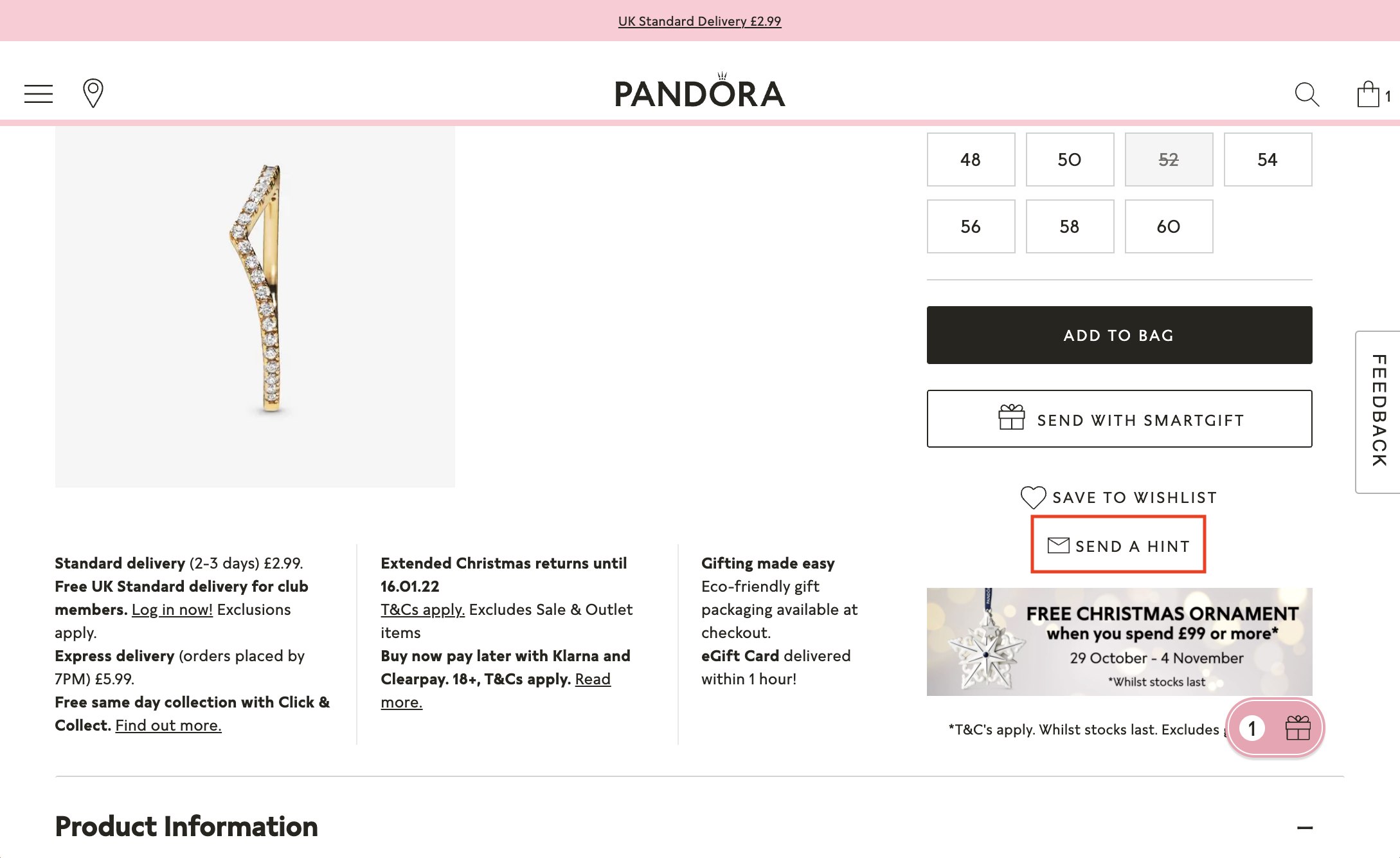
Send With Smartgift
This feature is a fantastic marketing tool — it gives customers all the freedom they need when choosing gifts. Their loved ones can modify or even select their gifts, which guarantees that they will be happy with their order.

Try It On
Try It On is a convenient feature and an enjoyable way of deciding between products. It’s almost like trying on products in a store. The Pandora website generates a QR code, and by opening it on the phone, customers can access the ‘Try It On’ feature and try on rings or any other jewellery. They can then see the pictures they took on their laptops. This feature saves time and helps the brand show they care about their customers, especially those who prefer online shopping over the in-store experience.

Send a Hint
A very subtle way of suggesting gift ideas customers would like to get is to send it via email or Facebook, and the recipient will get a direct link to the product.
Klarna Instalments
Paying with Klarna in instalments is an excellent alternative to expensive credit cards — they don’t charge fees or interest.

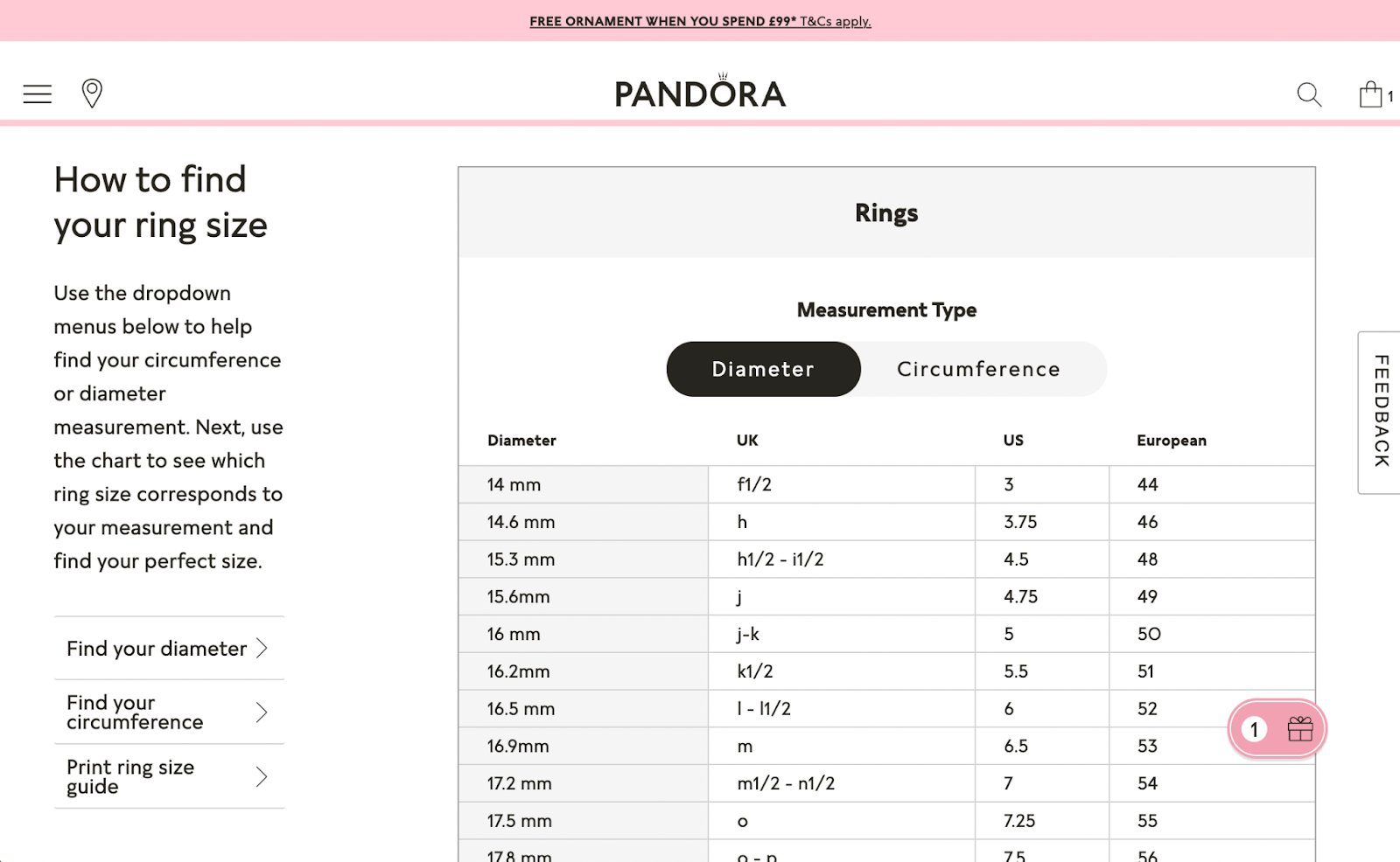
Size Guide
Jewellery sizes differ among countries and brands — placing a chart like this on your website will ensure your customers get the suitable sizes.
Complete the Look
In case your customers would like to select each product for their gift set individually, they have the option to do so — Pandora helps choose the pieces that look the best together.

Click & Collect
A free delivery option is available in selected stores. Perfect for last-minute gift shopping or spontaneous surprises.

Pandora on Mobile
The loading speed of the Pandora website on mobile is excellent — even videos load instantly when opening the website. Breaking up static images with animations and videos help keep the attention of the customer and offer a stunning way of showcasing products.

The different sections look just as great as on desktop — they use very clean lines, and the site is easy to look through.
The mobile version of the Pandora website shows the same detailed information on products as the desktop version in a more compact form.

When searching for products, the search bar is speedy to respond, and the page provides us with great options within a few seconds.
Style Advice
Style advice is available on selected days by customer service support only on a mobile. We definitely recommend adding this feature to your company’s page — sometimes, it’s easier to guide customers through your product selection in person.

Sustainability Initiatives
Sustainability has been at the forefront of many businesses’ agendas recently, and Pandora is no exception. They are committed to reducing their carbon footprint — in September 2021. They announced that by 2030, they would halve their greenhouse gas emissions by introducing their new low-carbon packaging. Having committed to reducing their carbon footprint by 3,600 tonnes of CO2 per year, Pandora’s packaging will no longer contain plastics — they roll out their new packaging throughout 2021 and 2022 after they use up their current inventory.
Pandora was always committed to creating hand-crafted products and this brand is taking a sustainability course.
Useful for you:
To have the lowest impact on nature, Pandora revealed that every single one of their products will be made from fully recyclable materials by 2025. Pandora is one of the top global sustainability brands that make a difference.[w4p_external_link]
WEB4PRO Recognized as Ukraine’s Most Recommended eCommerce Developer
 18 years ago WEB4PRO had a goal to provide great service quality for each customer. Now we are grateful to be an internationally recognized service provider. Here we are today, celebrating milestone after milestone. WEB4PRO set out to the eCommerce development world with one main objective, and that is to help brands and entrepreneurs reach success. It is with humble and grateful hearts that we announce that we were recognized as Ukraine’s most recommended eCommerce development company for 2021!
Established in 2003, we came together to help ease concerns that bug business owners. Filled with the finest project managers, designers, developers, and marketing experts, our team jive like a well-oiled machine, producing effective and powerful solutions for businesses.
Throughout our years in the industry, we’ve worked with countless clients from different industries and locations across the globe. Anywhere from consumer products, business services, education, medical, and real estate — we’ve elevated our clients to great heights.
This year, we’re absolutely honored to be recognized as part of The Manifest’s 2021 leading agencies!
To give you a better understanding, The Manifest is an independent business news platform dedicated to helping browsers navigate through the B2B space. The site is known for its incredible industry wisdom, blog-style content, and agency shortlists. This recognition from them means that WEB4PRO is among the top 15 most reviewed and recommended service providers in Ukraine!
Of course, we attribute this milestone to our clients who graciously review our services and constantly express their support to us. We are here today thanks to their trust, and for that, we are eternally grateful.
The road doesn’t end here though. We’re so excited to see what’s ahead for us. We can’t wait to unlock more achievements. Be part of that journey! Reach out to us and let’s connect.
WEB4PRO Is Recognized As Top Magento Developers by Clutch
WEB4PRO Receives an Award in Clutch’s Top Magento Designers & Developers
People nowadays don’t only look for companies that could help them grow. They also seek the ones that are client-oriented and responsible. Would you believe that there’s an e-commerce engineering agency that has those qualities? Well, WEB4PRO is glad to be among those.
Since 2003, our company has provided solutions and support in making our clients’ brands powerful and sustainable. We are an e-commerce advisor and reliable B2B partner. More than anything else, we help brands, merchants, digital agencies, and software development professionals produce effective practical solutions and customer-focused online stores. Every project we handle has one similar goal, and that is to share client’s values and help them realize the business ideas.
This year, Clutch, a B2B research firm specializing in ratings and reviews, awarded us as part of their top Magento designers and developers. We are very much honoured to receive this recognition from them. Of course, this wouldn’t be possible without the clients who willingly shared their experience and their partnerships with us.

“WEB4PRO is a truly flexible team. They managed to adjust to our business requirements and show themselves as professional developers and as people who understand our business needs and could give valuable business advice and solutions. They met our budget and time-frames and preserved all features necessary for our business—a highly professional team of eCommerce engineers and managers.”
– Bashar Ballout, Business Development Manager, Lab Test & Tools Manufacturer
We’re happy to have received this award from Clutch and believe that trust is the core of a successful collaboration. So, don’t hesitate to reach out to us, and let’s co-create outstanding products together!
MADLADY: The Nordic Trendsetter
Swedish womenswear brand MADLADY has served trendsetters of the Nordic market since 2011. With its distinctive designs, materials and fits, the brand’s goal was to stand out from the competition and encourage women to develop their unique style. The wearer of their garments will instantly radiate confidence, as MADLADY serves a wide range of products that fit any lifestyle and mood. MADLADY is all about being unapologetically fun and effortless.
Brand’s unique selling point is the distinctive style of clothing that’s not sold anywhere else on the Nordic market. This womenswear brand is the perfect destination for fashion lovers between the ages of 18 and 30. Their advantage lies in having an unbeatable range of clothing that offers a wide variety for fashion-conscious individuals.
MADLADY is for trendsetters, women who dare to stand out from the crowd. The visual representation and brand positioning create a coherent experience – the MADLADY website looks just as unique as the garments they sell.
Unique Garments, Unique Website Design
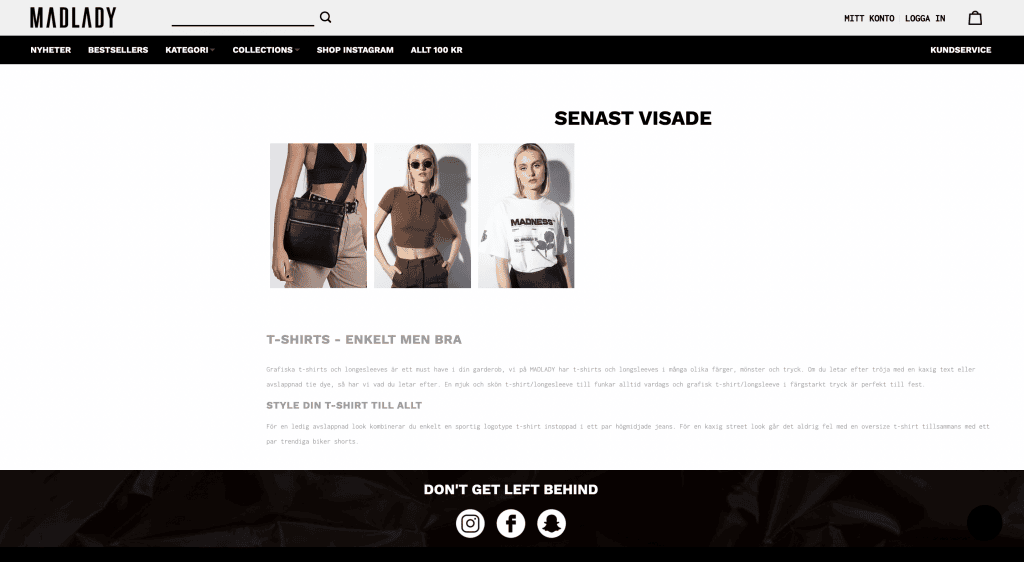
The Home Page is well-structured – it’s effortless to navigate through their current influencer collaboration, the ‘Recommended’ section and the ‘Bestsellers’ list. The product titles are easy to read in bold and the colours used are easily associated with the MADLADY website. This kind of consistency creates trust and recognition. Creative font combinations and the contrast of black, white and pastels give the site a fantastic feeling – ideally in line with how they position themselves on the market. From the home page, we can navigate the top menu to News, Bestsellers, Categories, Collections, Instagram shop and Sale.

Intuitive Navigation And All The Useful Information You Need
Home Page
The Home Page features a clean design, and its navigation is very intuitive. The brand included a footer text on the website that complements what’s written on the About us page. Reassuring customers that it’s safe to shop at MADLADY is an excellent move. Including a few lines about their customer service and shipping time answers many frequently asked questions in advance.
 Having transparent information about the shipping policy is always a huge plus. It’s a great idea to have it all right on the Home Page. MADLADY makes the user journey effortless by including all the necessary information to purchase securely and safely. There are no unanswered questions under the Returns & Exchanges, Delivery information, Gift card, About us, and Sustainability & Social responsibility tabs. It’s easy to get in touch with the MADLADY team.
Features That Help Create The Right Expectations
Category Page
At the bottom of the Category Page, we have a description that highlights the products’ features and styling ideas and all the occasions that MADLADY products are the perfect choice for. Including a not only informative but also keyword-rich description helps SEO efforts immensely.
We can sort the products with filters on the Category Page. Sale price percentages are highlighted in yellow – accentuating great deals so customers won’t miss them.

Product Page
On the Product Page, we can read a brief description of the features we can find here. We have a short description of the product specifics, and we can also see the size the model is wearing. Besides, on the product page, we can get more information on the fit, material, length, article number and brand right on this page. This way, the customer doesn’t need to take any further actions to find this important information. We can see that the available sizes are showcased in swatches, reducing the friction required to purchase the product.
 There is a handy size guide as well. On the right-hand side, ‘Others also bought’ offers pieces users might like and helps the brand increase customer involvement and order generation.
Read more here on how to design a Product Page that converts!

Shopping Cart & Checkout Process
MADLADY offers various payment methods and a secure one-page checkout process – moreover, Klarna, especially popular in Sweden and other Scandinavian countries, is also available. On the right-hand side, we can see the contents of our cart.

Effective Features That Will Help You Sell More
Products are not only sorted based on product types but also collections. This comes in handy, especially when users look for a specific product or pieces from a particular influencer collaboration. The ‘Collections’ tab navigates us to a page with all of the garments of said collections, and there we can sort them according to different criteria.
 The product slider on the Home Page changes based on personal interests. For example, we were looking at a specific t-shirt and going back to the Home Page, the ‘Recommended’ section now mainly consists of t-shirts. Intelligent personalization features like this increase the chances of users finding what they are looking for.
 ‘Bestsellers’ list features one make-up product – this trick is effective because visitors can see that MADLADY sells make-up as well in case they weren’t familiar with the brand already. By reselling make-up products that appeal to their desired audience, they become a one-stop-shop for women’s style.
 ‘MADLADY tribe’ features Instagram posts from creators wearing their products – it gives instant styling ideas and creates trust in users to see real people wearing their clothes.

On the ‘Sale’ page, we can sort products based on category, price and size. It’s a fantastic idea to have all the products that are on sale under one tab.

Besides the sale price, they include the original price and the discount percentage as well.

Madlady On Mobile
The website’s loading speed on mobile is good, especially when we consider that high-quality pictures usually slow down the loading speed.
The tile sections look just as great as on desktop – very crisp lines make it easy to look through.

The mobile version shows the same information on the products as the desktop version – users won’t miss a thing even when they’re on the go.

When searching for products, the search bar auto-fills and offers possible search terms – this feature makes it easier for customers to get an idea of what to search for if they’re just browsing the site.

Optimizing your website to be fully functional and visually appealing on mobile has never been as vital as it is today. Though customers are always on the go, they still prefer websites with beautiful designs and handy features that create a fantastic user experience.
Conclusion
MADLADY can’t be influenced. She is the one who inspires. The brand’s buyer persona is this radiant, free-spirited girl who wears what she wants without a second thought. Perfect fit, material and unique ideas make the MADLADY garments powerful. This website is the one-stop-shop for women with a unique style who dare to be different. We believe MADLADY is an excellent source of inspiration that encourages you to be yourself — the most incredible version of yourself.
– Don’t be a chicken. Be mad. © MADLADY
John Henric Review: Website Features and User Experience
Thirteen years ago, Nicklas Nordbergh and John Ekström had a dream. Their goal was to craft accessories that take men’s style to the next level. Thanks to their immense creativity and the best possible craftsmanship, they reached their true potential, and now we are happy to introduce a powerful John Henric menswear brand.
It all started in Lund – a historical city in Sweden. At the outset, they created high-quality accessories, but later they branched out to produce clothing items and bags. This decision made all the difference for the brand – the company gained more exposure due to the production of clothing items. Jon Hencic’s creation process was inspired by Swedish and Italian fashion – to this day. They provide customers with a one-of-a-kind experience, thanks to the website’s luxury feel and garments.
John Hencic brand prides itself on creating “affordable luxury.” They employ small and often family-owned businesses instead of suppliers, making it easy for the company to manage its inventory and stay on top of seasonal changes.
Nicklas Nordbergh (Creative director) identified a gap in the market. He claimed that male accessories were overlooked – so he wanted to change the scene by creating fun and expressive accessories. His love of entrepreneurship drove John Ekström (CEO), and his goal was to create a niche accessory brand, which he had built from the ground up with Nicklas.
This John Henric review article will show you how the luxury feel of John Henric garments translates to the remarkable experience on their website and how these two components create a great user experience.
Overall Impression of John Henric
On the John Henric clothing website, we have a high amount of information, yet it’s easy to navigate the site. You’re going to find what you are looking for in seconds, as the well-structured layout makes it easy to read titles and product names. In addition, the website uses engaging visuals, so the user can easily browse any category. Also, if we start navigating using the top menu, we’ll see that some categories show a visual association with them.

Why this is useful: it decreases the time users spend thinking and finding the right product. Not to mention, it creates clear expectations.

In the following paragraphs, we will take a look at the desktop version of the website – the home page and navigation, the category page, and the product pages. Finally, we’ll examine the useful marketing features they employ.
John Henric Features Optimized For Success
Home Page & Navigation
The tile structure makes it very easy to navigate and look through various elements. They emphasized visuals – this way, the amount of information is not overpowering at all. Under the tile structure, we see a brief description of men’s accessories and how they can elevate any look. If you look closely, you can see how the brand uses keyword-rich text here. They also offer insight into styling the pieces.
Pro tip: using top keywords like John Henric will help your SEO efforts

Including a ‘What our customers are saying‘ block provides social proof about the brand. New customers will feel sure and secure about their choice. On the John Henric website, it’s especially well-positioned right at the bottom of the home page. Customer reviews are inevitable for a growing business. Read more about them in our guide

Features That Help Create The Right Expectations
Category Page
On top of the Category Page, we have a description highlighting the products’ features and styling ideas. Again, they use keyword-rich text here, which helps them achieve favorable Google search results.

We can sort the products with filters, and if we hover over the pictures, we can see the products from another angle and light. It helps customers create the right expectations and not spend time on products that they don’t like. Thus, it contributes to a more positive and smooth shopping experience. Besides another photo, they also have available sizes written over each product as we move the cursor over them. This way, shoppers can quickly see if the store has their size in stock, and if not, they can move on to the Google search results for products they like.
We can find a ‘star‘ icon near each product, allowing us to add the product to the wish list and return to this product later. Wish lists help brands return customers to their stores with the newsletter. They can also use this data for customer-focused advertisement campaigns.

Another trick they use on the Category Page: the brand shows discounts (30% off, etc.) to create urgency. This is how they show customers that they shouldn’t miss out on a great deal. It encourages faster decision-making. This trick works because we are psychologically coded to desire exclusive or only available things for a limited time.
This page has a ‘display mode‘ feature allowing us to scale the grid and get a larger view of products.

Product Page
We can find all the necessary information on the Product Page – the price, available sizes, product description, and specifications.
‘Model is also wearing’ is a section on the website where the various products that constitute the outfit are listed. Customers can purchase them as well. It’s a great way to encourage them to buy more if they like the look – or even the whole outfit if it is still available.

Under the product specifics, we have a ‘Recently viewed‘ section, reminding the customers of the products they already visited but might have forgotten about.
‘Recently viewed‘ and ‘Others also viewed‘ are features that brands use to encourage customers to stay on the site longer and possibly purchase more. The Recently Viewed feature can also come in handy when people are looking for one specific item, for example, a blue polo neck shirt. If the website has four different blue polo neck shirts, the customer can see them side by side after visiting their product pages.
Important elements that help customers develop decisions quickly and confidently are product return policy, delivery details, and size guide. It’s an advantage that they don’t take the user to another page but open a pop-up window, which is easily accessible right from the product page. Another good thing is size swatches – you can see all the available sizes at a time, which decreases the friction needed to buy the product.

One-step Checkout Process
John Henric uses a one-page checkout process, where we can see all the purchase details on one page before hitting ‘Proceed to card details.’ Having only one page makes the checkout process way faster than entering all of our details on separate pages. In addition, this makes it easier for the customer to review the order details and their personal information instead of clicking-through various sections to reach the payment method.

More and more people are aware of the importance of a secure checkout process – it always helps your objectives to have an SSL certificate on your website. In practice, it means that your website URL starts with ‘https://’ instead of ‘http://’ and provides a secure checkout.
Marketing Tactics You Should Try
John Henric offers Free shipping and Home delivery, which they state on top of their website – having a static note like this is a popular marketing feature. People don’t like surprises and hidden costs, but they appreciate clarity from the beginning of their shopping journey.

Products are not only sorted based on product types but also events like proms & weddings. This feature offers another excellent way for customers to look for the perfect outfit for an important day in their lives.

The Style Guide Page works as a shop assistant for men, helping them achieve a stylish look, select the right accessories, and wear them properly. Providing style ideas supported by pictures creates credibility for the brand and gives many ideas to customers. Having a wide range of beautiful products is essential to satisfy various tastes. Brands are expected to create inspiration and educate their customers on how to wear their products.

The wish list button for the products allows you to save favorite or most interesting products and simply add them later to the shopping cart – just like the clothes in the fitting room.

In this section we made a John Henric review of the best features that make the website on desktop stand out – now let’s see John Henric on mobile. Read on to see how they mastered mobile optimization – and how you can, too!
John Henric Review On Mobile
The website’s loading speed is just as fast on mobile as it is on desktop. This is key to customer retention as they tend to be discouraged by slow loading speeds.
The discount pop-up is proportional to the screen – seemingly small details like this contribute a lot to a luxury user experience.

The tile structure looks just as great on mobile as it does on desktop – on a smaller screen, we only have one column, but it is very easy to read. The Categories menu on mobile uses the power of tiny visuals to make its usage more intuitive. On a small screen, having a scrollable menu on the side is way more user-friendly than a static top menu.
The mobile version shows the available sizes of products on the category page if we tap on a product while scrolling. This is highly efficient when shopping on mobile because a split second is more than enough for the customer to see if the retailer has their size in stock.
On mobile, search suggestions offer the most searched terms – offering some great ideas to those just looking around on the site.

Another great feature here is the list of all available payment options – it’s handy for customers and allows the brand to offer the most convenient checkout experience. Users like transparency and predictability – this is an excellent example of a user-friendly checkout process.

Despite having many high-quality photos and all the information we need about their products, John Henric’s website has an excellent loading speed even on mobile. It’s safe to say that the website is optimized for smaller screens – it offers the same high-end web experience as the desktop version while also having all the features accessible.