Pandora is a Danish jewellery company focusing on creating distinctive, high-quality products at an affordable price point. Their story started in 1982 when Per Enevoldsen and his wife Winnie founded a small jewellery shop in Copenhagen. Thailand has always played a big part in the company’s life, as they imported products from the country from the beginning. The Pandora brand has taken up in just seven years, so they decided to start manufacturing their jewellery there. In 1987, the first in-house designer joined the team, and this way, they could focus on creating their jewellery.
In 2000, Pandora’s very own charm concept launched — with great success. The company began expanding internationally, and since then, they opened various crafting facilities.
Today, Pandora products are available in more than 100 countries and the company employs around 26,000 people.
Pandora is very transparent regarding its brand strategy — you can read detailed information on its four growth pillars. In this article, we will review the features on the Pandora website that create a smooth user experience and make it easy for customers to find the perfect gift for their loved ones.
Feminine Touch and Well-Structured Elements
The page structure is efficient, as the first thing we see is the seasonal offers. The titles and product names are easy to read — this layout makes it effortless to focus on one thing and then move on to the other. There are no disturbing elements, such as pop-up windows, that would obstruct the user experience. Regarding the colour choices, the pink accents give a feminine touch to the whole website.

Intuitive Navigation & All The Useful Information You Need
Home Page
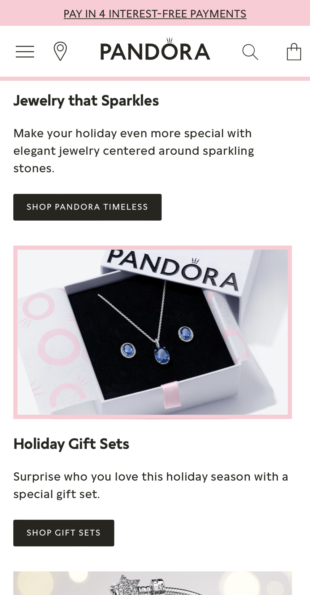
The Home Page has a clean design. It’s easy and intuitive to navigate. The seasonal home page gives a homely feel even at first glance. It’s never too early to start shopping for Christmas presents, and Pandora knows that — clicking on the header navigates us straight to the gifting section. Here we can choose gifts based on categories, like daughter, friend, mom, etc. There are no questions left unanswered under the Customer Service tab at the bottom of the page.

Features That Help You Choose The Perfect Gift
Gift-Oriented Category Pages
Pandora has various category pages to help customers find their way to the perfect gift for themselves or their loved ones. Let’s start with Christmas — here we can see subcategories, such as Christmas Jewellery, Christmas Charms, Pandora Set, Gift Sets, Easy Gifting, Stocking Fillers, and Gift Cards.

Each subcategory has its unique SEO-friendly description, making it easy to find specific products straight from Google search results.

Customers can also Shop by Price and get inspiration from the brand under the Christmas tab.
Another category we have to mention here is the Pandora Brilliance collection, a higher price range collection — a helpful feature here is Shop by Metal.

And then we have the category ‘Charms and Bracelets’, Pandora’s signature collectable products, and ‘Jewellery’ dissected into jewellery types. The brand is big on gifting. This is why they have so many guides and helpful features for those looking to gift Pandora Jewellery.

Customer-Oriented Product Page
On the Product Page, we can find all the information a customer needs. Right under the price, we can see the payment methods, such as Klarna, Clearpay, and PayPal.

Besides photos from every angle, reviews are the next best thing a brand can put on the product page. Under the images, we get all the shipping and return information customers possibly need, and also some gifting options.

The Compatible With section offers various choices to complement the chosen product.

Smooth Shopping & Checkout Process
The Pandora website has a secure one-page checkout process — they offer various payment methods, such as paying in instalments with Klarna (Express checkout). Moreover, Clearpay and PayPal are also available. Klarna partial payments allow customers to separate their payments into three parts. This feature also shows how brands care for their customers and take their preferences into account.

Features for Seamless User Experience
Products can be sorted based on product types and also Collections, Events, and Gifting. This way of sorting is helpful if customers are looking for an event-specific gift or have a rough idea, but they’re not sure about the exact product they are planning to give.

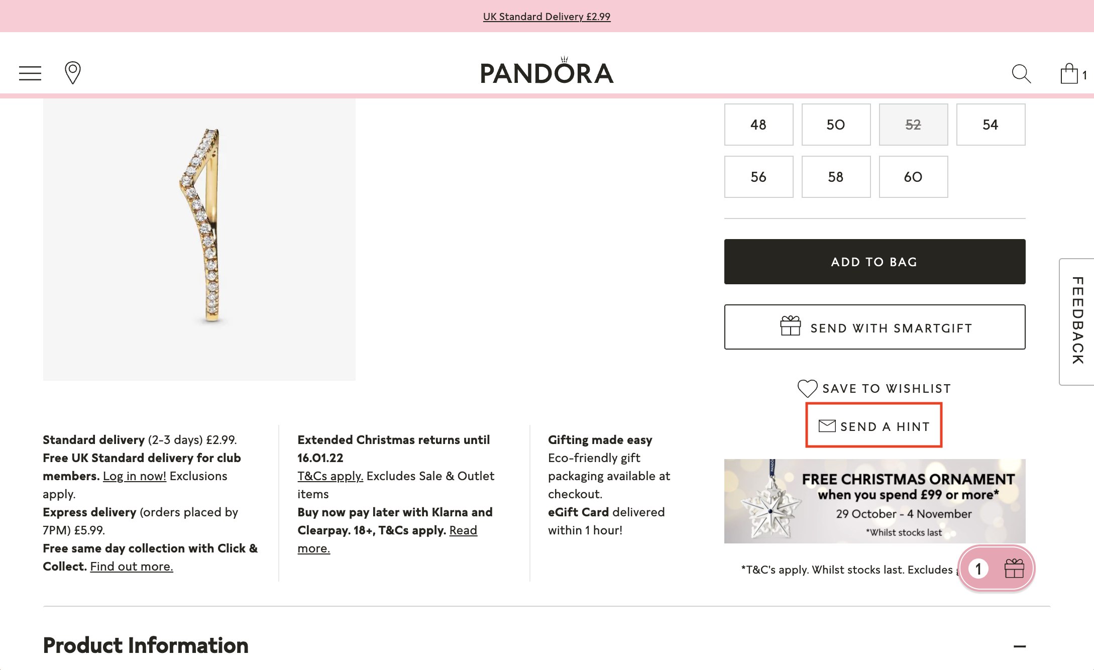
Send With Smartgift
This feature is a fantastic marketing tool — it gives customers all the freedom they need when choosing gifts. Their loved ones can modify or even select their gifts, which guarantees that they will be happy with their order.

Try It On
Try It On is a convenient feature and an enjoyable way of deciding between products. It’s almost like trying on products in a store. The Pandora website generates a QR code, and by opening it on the phone, customers can access the ‘Try It On’ feature and try on rings or any other jewellery. They can then see the pictures they took on their laptops. This feature saves time and helps the brand show they care about their customers, especially those who prefer online shopping over the in-store experience.

Send a Hint
A very subtle way of suggesting gift ideas customers would like to get is to send it via email or Facebook, and the recipient will get a direct link to the product.

Klarna Instalments
Paying with Klarna in instalments is an excellent alternative to expensive credit cards — they don’t charge fees or interest.

Size Guide
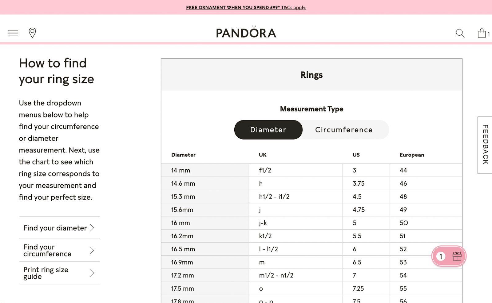
Jewellery sizes differ among countries and brands — placing a chart like this on your website will ensure your customers get the suitable sizes.
Complete the Look
In case your customers would like to select each product for their gift set individually, they have the option to do so — Pandora helps choose the pieces that look the best together.

Click & Collect
A free delivery option is available in selected stores. Perfect for last-minute gift shopping or spontaneous surprises.

Pandora on Mobile
The loading speed of the Pandora website on mobile is excellent — even videos load instantly when opening the website. Breaking up static images with animations and videos help keep the attention of the customer and offer a stunning way of showcasing products.

The different sections look just as great as on desktop — they use very clean lines, and the site is easy to look through.

The mobile version of the Pandora website shows the same detailed information on products as the desktop version in a more compact form.

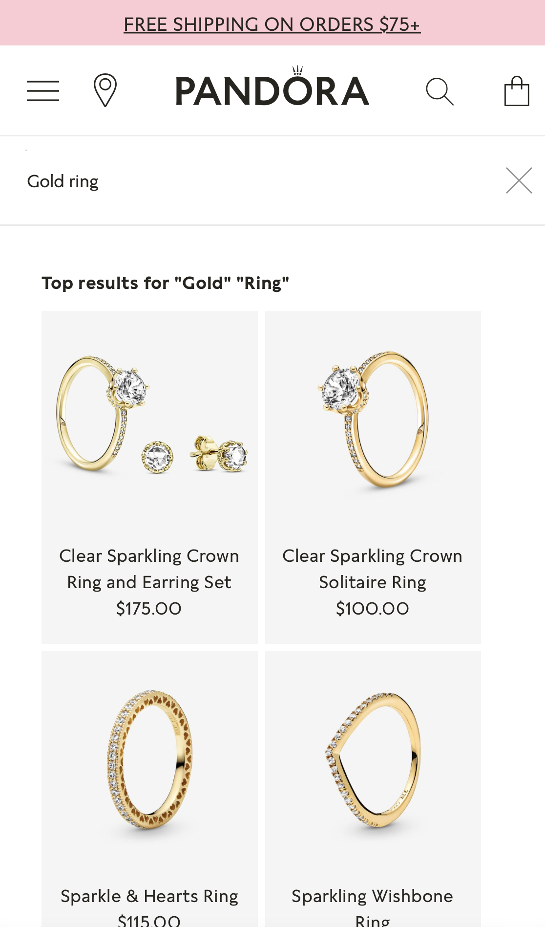
When searching for products, the search bar is speedy to respond, and the page provides us with great options within a few seconds.

Style Advice
Style advice is available on selected days by customer service support only on a mobile. We definitely recommend adding this feature to your company’s page — sometimes, it’s easier to guide customers through your product selection in person.

Sustainability Initiatives
Sustainability has been at the forefront of many businesses’ agendas recently, and Pandora is no exception. They are committed to reducing their carbon footprint — in September 2021. They announced that by 2030, they would halve their greenhouse gas emissions by introducing their new low-carbon packaging. Having committed to reducing their carbon footprint by 3,600 tonnes of CO2 per year, Pandora’s packaging will no longer contain plastics — they roll out their new packaging throughout 2021 and 2022 after they use up their current inventory.
Pandora was always committed to creating hand-crafted products and this brand is taking a sustainability course.
Useful for you:
To have the lowest impact on nature, Pandora revealed that every single one of their products will be made from fully recyclable materials by 2025. Pandora is one of the top global sustainability brands that make a difference.[w4p_external_link]
