
Learn how to elevate the success of the store with minimalistic design and powerful brand’s philosophy.
Filippa K is a Swedish clothing brand. It was founded in 1993 by Filippa Knutsson and has grown to be one of Sweden’s leading fashion brands. The company is based in Stockholm and also operates a growing number of profile stores in Scandinavia, the Netherlands, Belgium, Germany, and Switzerland.
Minimalistic design, sustainable philosophy are what make Filippa K strong and unique clothing brand. Their dedication to high-quality fashion-wear is impressive. However, what makes Filippa K even more different is their responsible attitude to sustainable fashion and manufacturing. Taking leading positions and awards in sustainability, they empower their customers to build a durable wardrobe with qualitative, luxury, and timeless garments.
Looking at the successful example of Filippa K brand strategy, we want to make a review of their store, and show you the essential features for the clothing store website to consider. Let’s move on to the store functionality.
Website Overview
The first impression when you enter the site is pleasant. You see the minimalistic image, the main banner with the recent collection, and navigation menu with all the categories.

After you check all of the categories, you notice that all the pages are performed as a sidebar which is convenient for the process of making buying decisions.
A customer can reach the information in several clicks, which proves excellent usability of the site.
Now let’s move on to the store functionality. We will explain the important things to consider for your store if you want to provide the best customer experience and keep your business on track.
Functionality
Filippa K store consists of:
Filippa K has a simple, yet convenient site structure. A customer gets clear navigation within the store, which we will review below.
Desktop
Home Page & Navigation
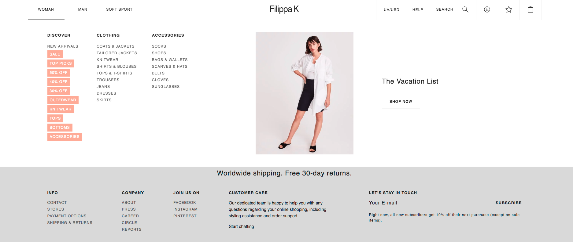
Navigation plays a key role in building great UX. It requires to place the most important information and featured products on the main pages. The navigation menu of Filippa K is simple, minimalistic, which is great and doesn’t distract the user. This lets customers browse and shop easily because clean design with minimum sections cuts off the time for a search of the particular item.
In general, Scandinavian design is quite popular worldwide, and it can be adopted in foreign markets.
A header has three product categories:
- Men
- Woman
- Soft Sport
The minimization of the number of categories makes it easier for a customer to find the target product.
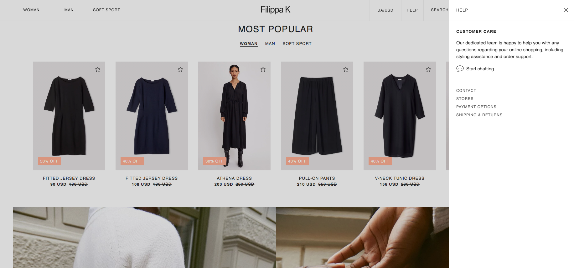
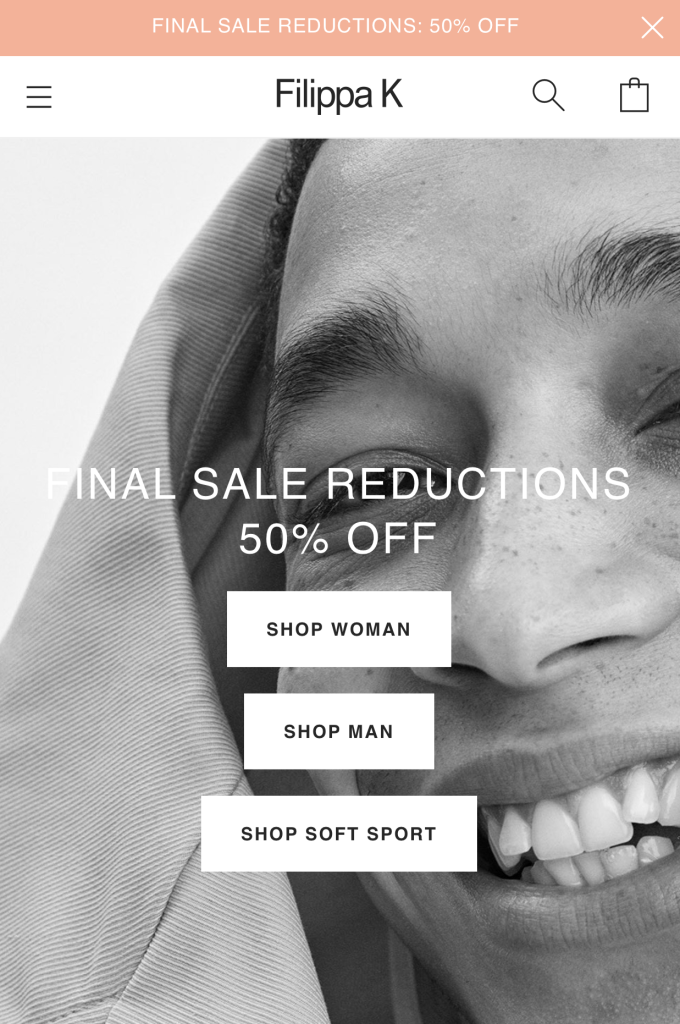
At the top of the page above the header, you can see the line that says free shipping, or some promotional information. This spot is called Top Promo Banner. It will help you to show more of your new discounts, and let your customers buy more products and try out hot deals with some promo codes available.
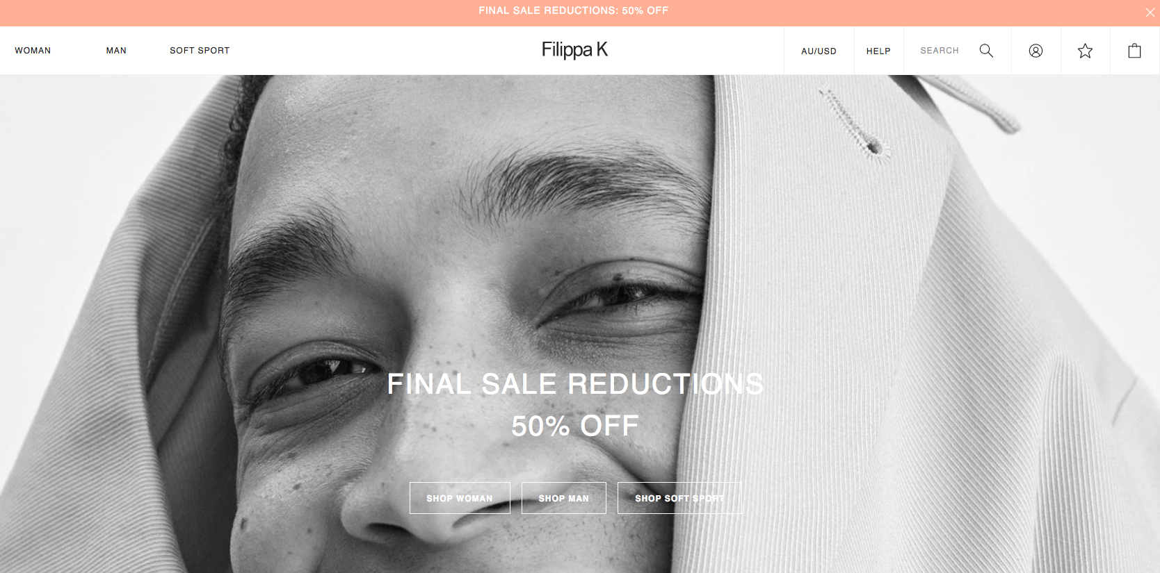
This will increase customers’ loyalty and attract more visitors to your store. Filippa K has Top Promo Banner that tells about free shipping and returns. You can add this block to all important pages and get the most of it.
Below the header, you see the banner with product categories. The banner has main categories of clothing to attract their clients to these pages. We also notice an impressive feature called shown in the image. You simply click on the number at the right corner of the image and get a sidebar with the information related to the products shown on the picture.
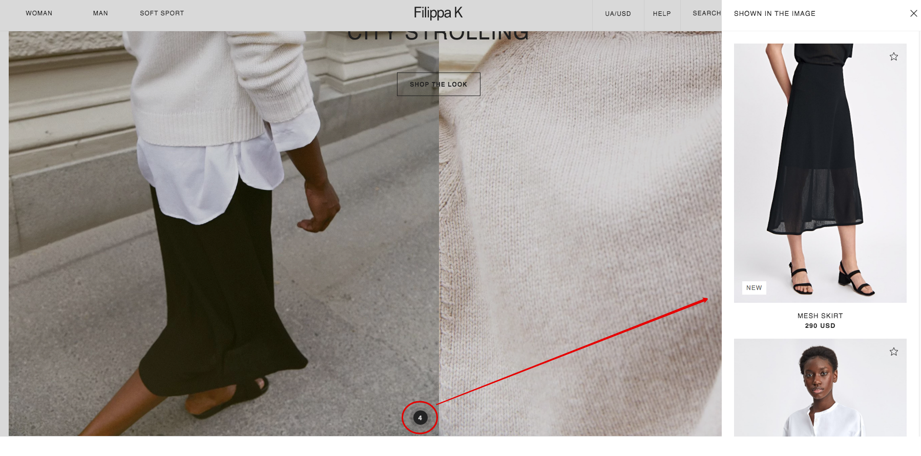
Also, this lets Filippa K showcase featured collections and their vision for all customers that come to their site and gain a foothold in customers’ mind.
Product and Category Pages
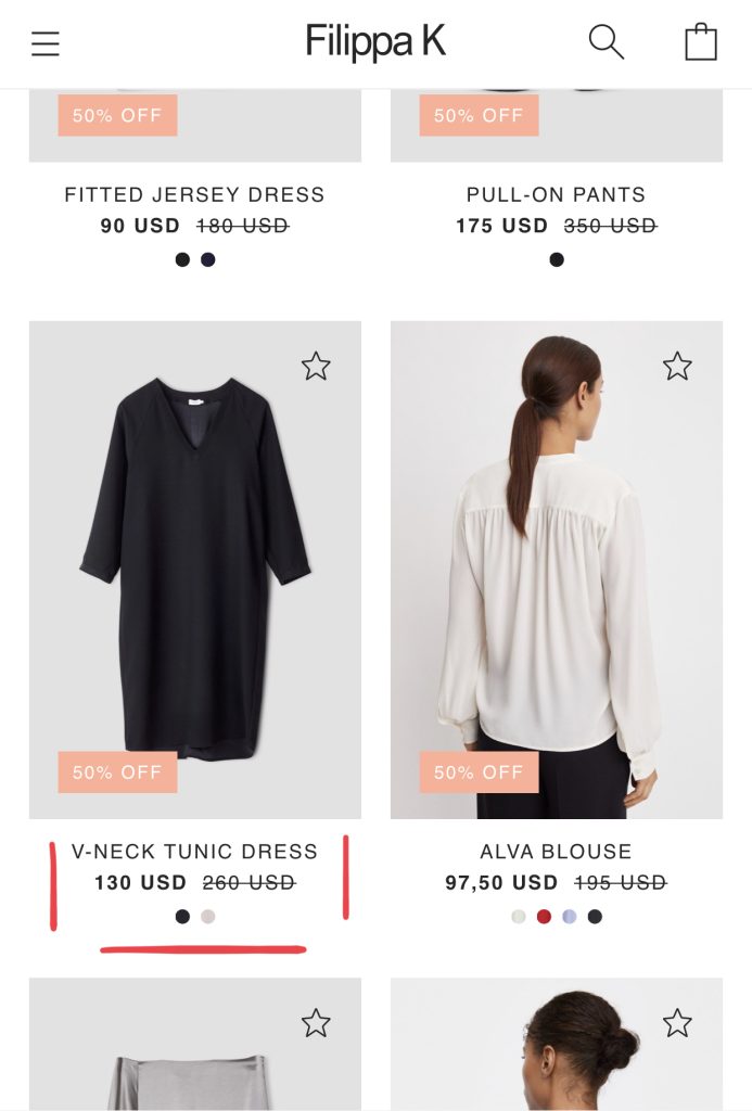
What is one of the most crucial in any store besides convenient navigation? Of course, beautiful, detailed, and qualitative product presentation. All of it you can find at the category and product pages.
When you enter one of the categories, you’ll appear at the category page with all products’ range. Filters are performed in a standard way when you can select some parameters from the list, and apply them to find the exact product. However, filtering could be improved by making the selection of parameters instant without page reload. This will save time for search of a product.
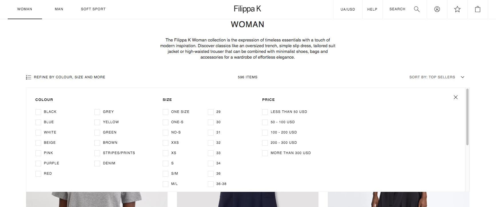
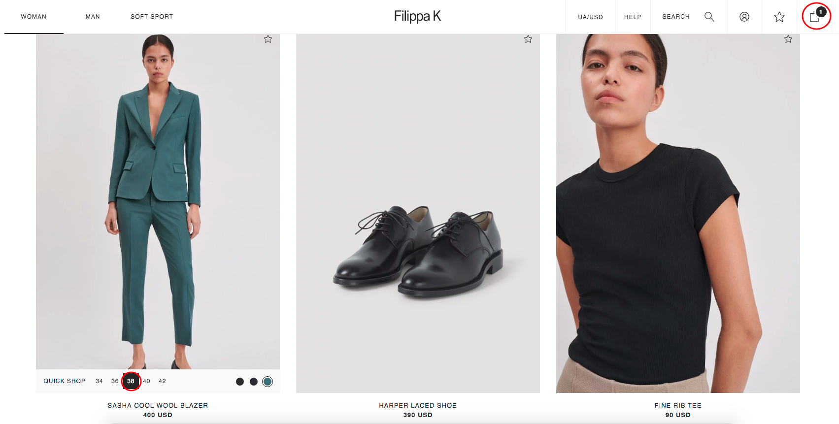
Filippa K has a high quality of product images that let the user see the product in a better way. Another benefit of the product listing is that you can make a quick order by choosing the size, and then your product automatically appears in cart. Also, the ability to select a different color without going to the product page will make interaction with product smooth, and increase the chances for a purchase.
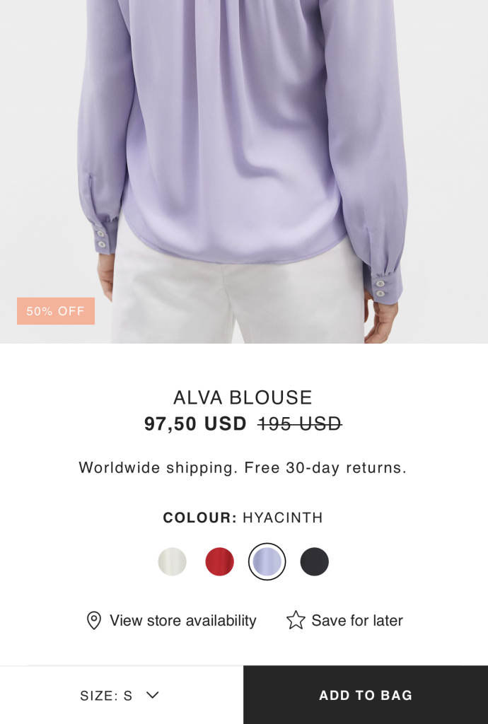
Each product has its page with a description, product images, Swatches, Select Size and Size Guide, plus Add to Cart and Add to Wish List.
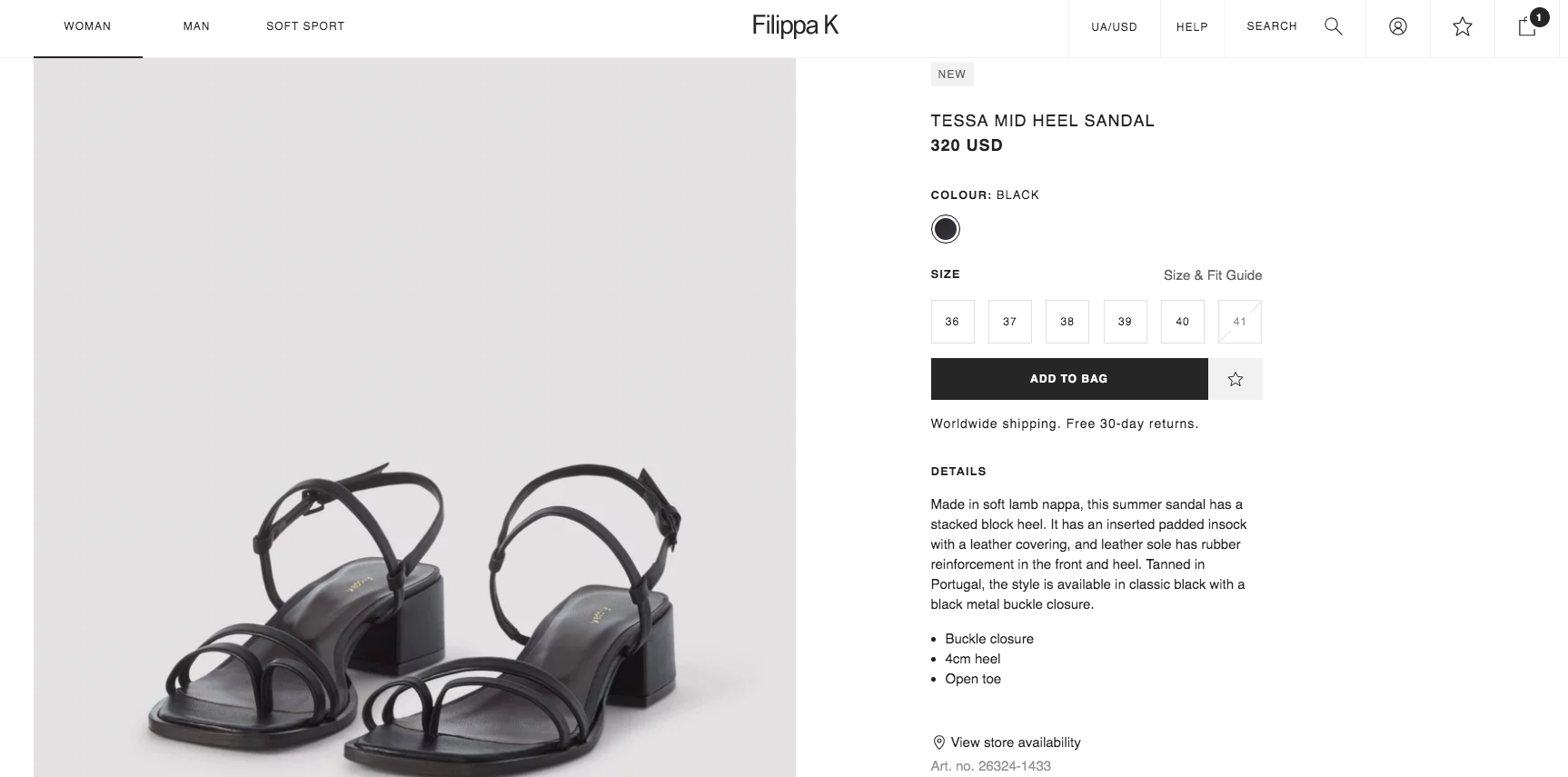
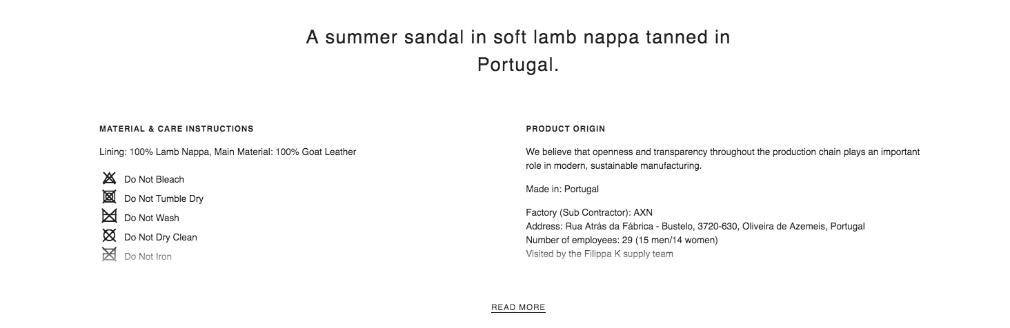
Also, a product page has detailed information not only about material & care instructions and general description, but also product origin information. This proves that Filippa K has transparency in their manufacturing processes, and gives a customer even more information about all stages of the production cycle. It creates trust and close communication of the brand with a customer.
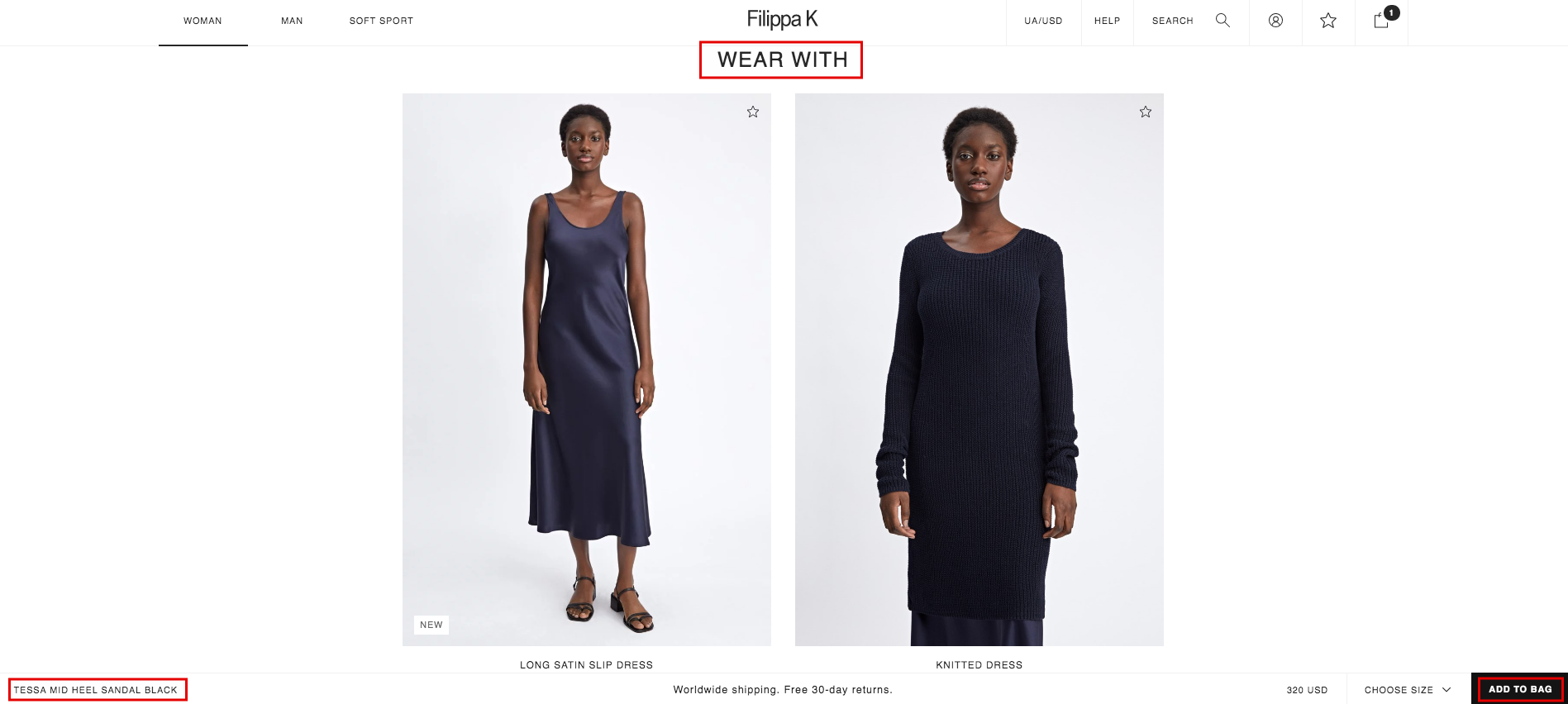
Filippa K has an additional feature called Wear With. This attribute is needed to link the product with other matching products from the store. That’s how you can assure cross-selling. Also, if you scroll to the bottom of the page, you still can order the product by selecting a size/color, and clicking the Add to cart from the pop-up window. This is very convenient in case if a customer sees other products but still remember about the initial product on the page.
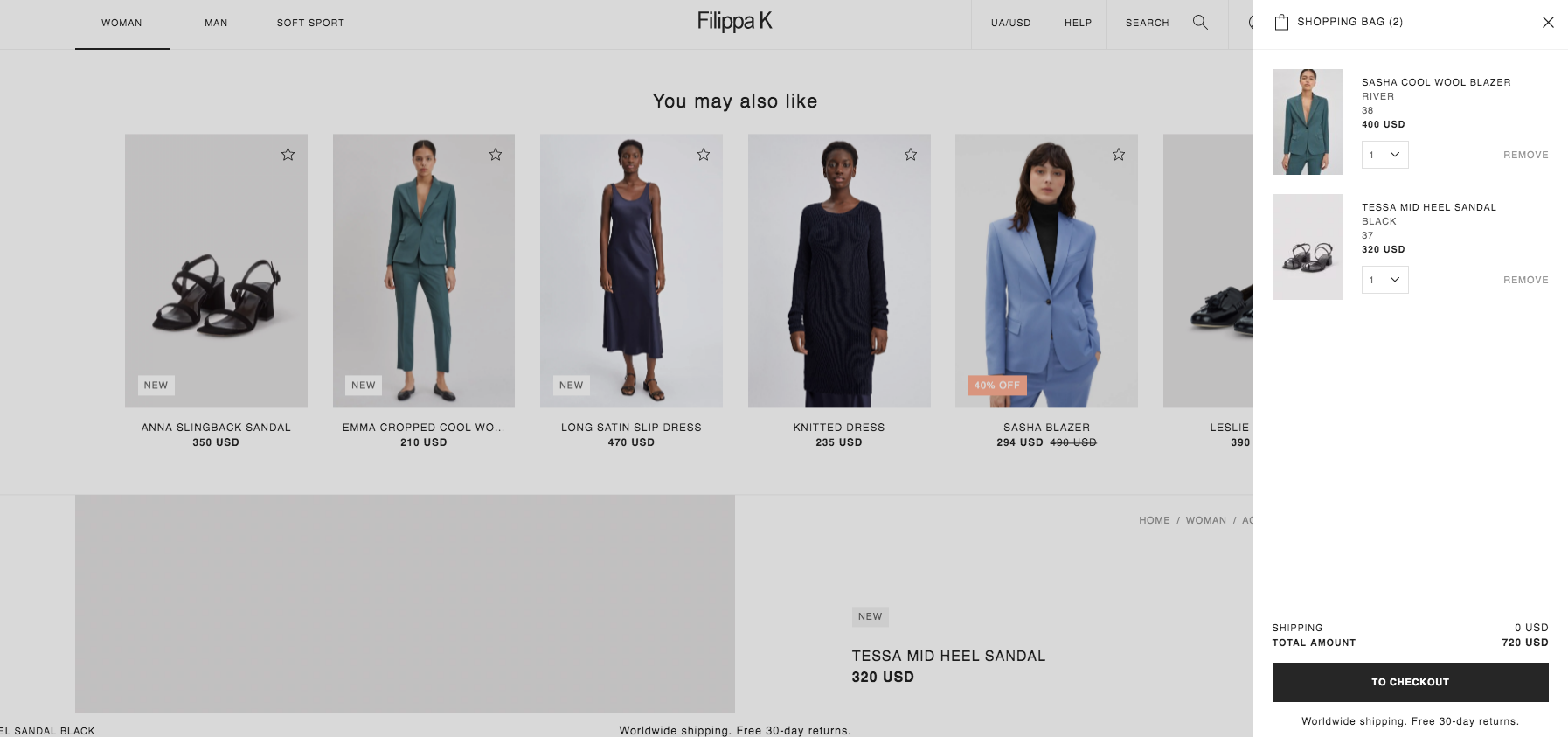
After a user added product to cart, the page goes back to the top, and a customer sees You may also like block. It helps to show similar products to the initial one or to present popular items at the store. In the case of the selected product being out-of-stock, a customer can choose a similar one from the feed and still make the purchase. Then a customer needs to click on the shopping bag to go to the Checkout page to complete the order.
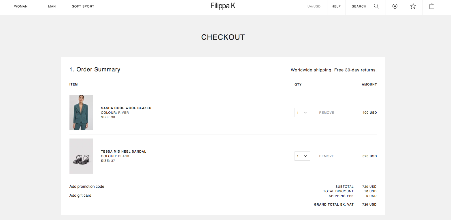
Checkout Page
Customers often want to buy the product quickly without filling out lots of information. That is why most of the stores and Filippa K isn’t an exception, prefer to use One Step Checkout. It requires to fill out the information on one page and then redirect you to the order summary.
Payment Methods
Filippa K store has two payment options:
- PayPal
- Debit/Credit Card
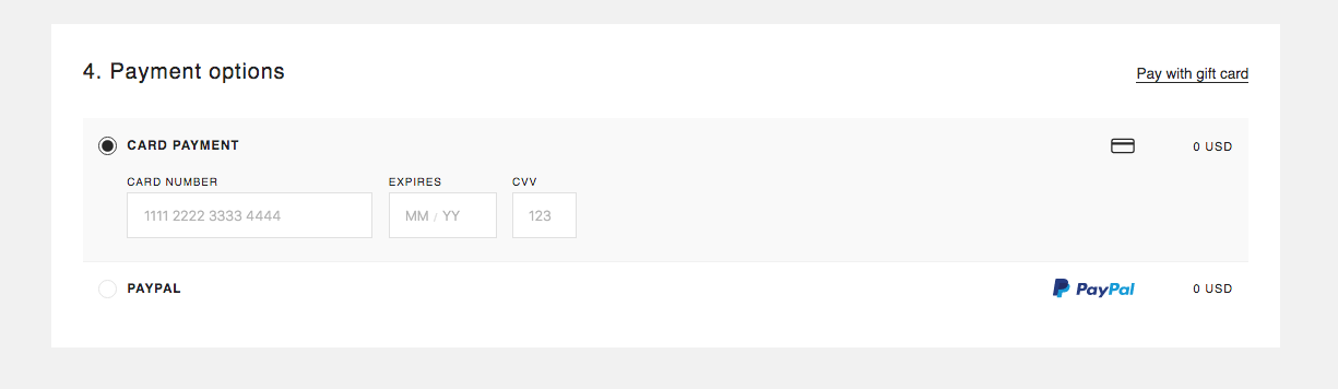
These payment types are suitable for most of the clients. However, integration of Split Payments, Store Credit, Checks will give more options for the user to complete the order. So, if you are looking to make the best user experience and increase your sales, then consider making a wide range of payment options.
Marketing Kit
Here is the list of useful marketing pages and features for customers’ convenience:
- Store Locator – helps to find the nearest store.
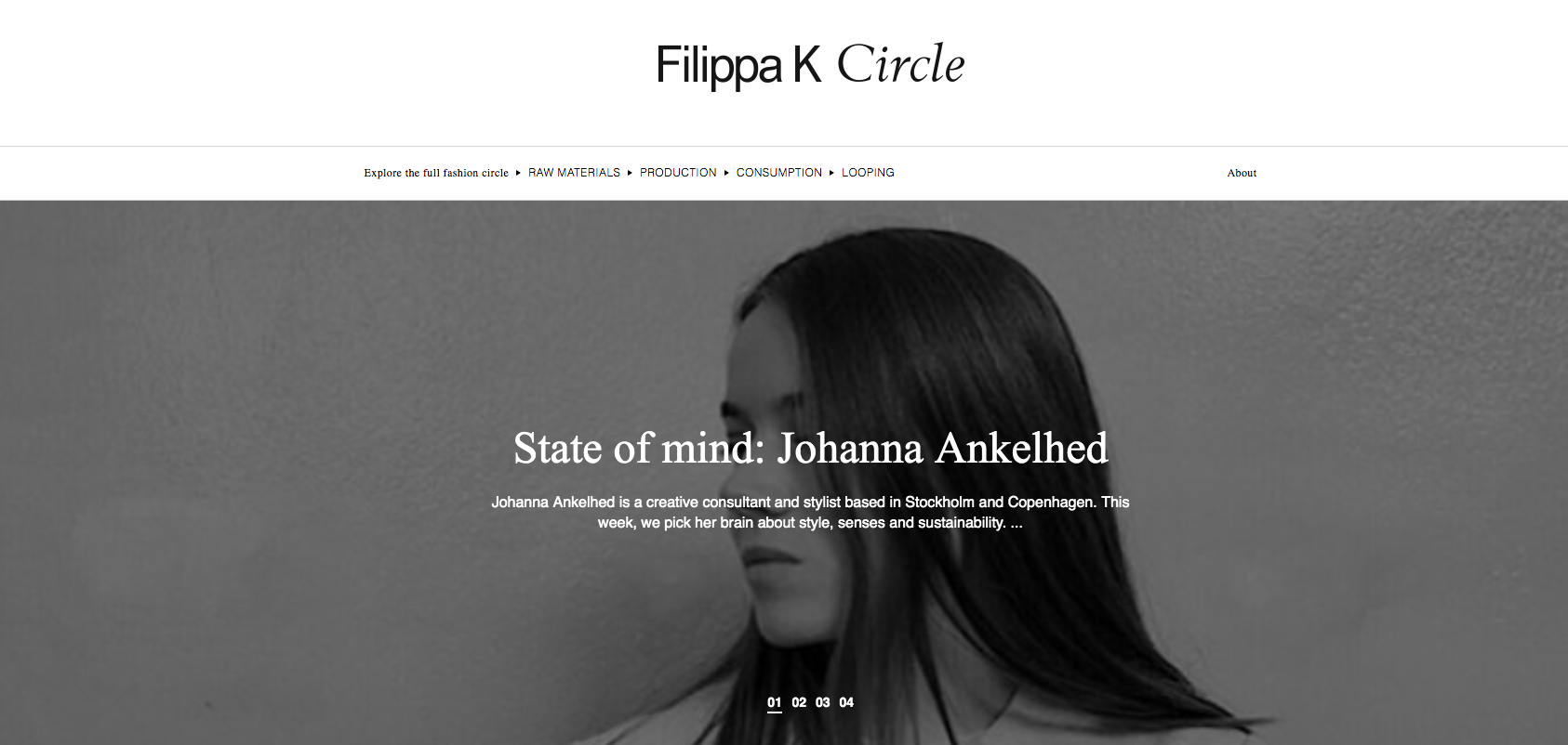
- Filippa K Circle – a company’s blog that has articles, annual reports, activities, charity and sustainability campaigns, and plans. This lets Filippa K to build their name and to get acquainted with their audience with the brand and gain people’s loyalty. There are several topics about sustainable manufacturing and consumption, and also interviews with like-minded people.
- Sustainability at Filippa K – this page includes the explanation of how Filippa K works to produce recycled garments, their mission, and a result that you can check in their latest report.
Those features help clients’ find relevant information about the company, location of stores, manufacturing process, and learn more about the brand.
Now, let’s explore the mobile website look and feel because the tendency of shopping from mobile devices is continually growing. More customers are choosing to buy with their phones because they can do it from any place and on the go. Improved mobile shopping experience also increase the number of orders at the store.
Mobile
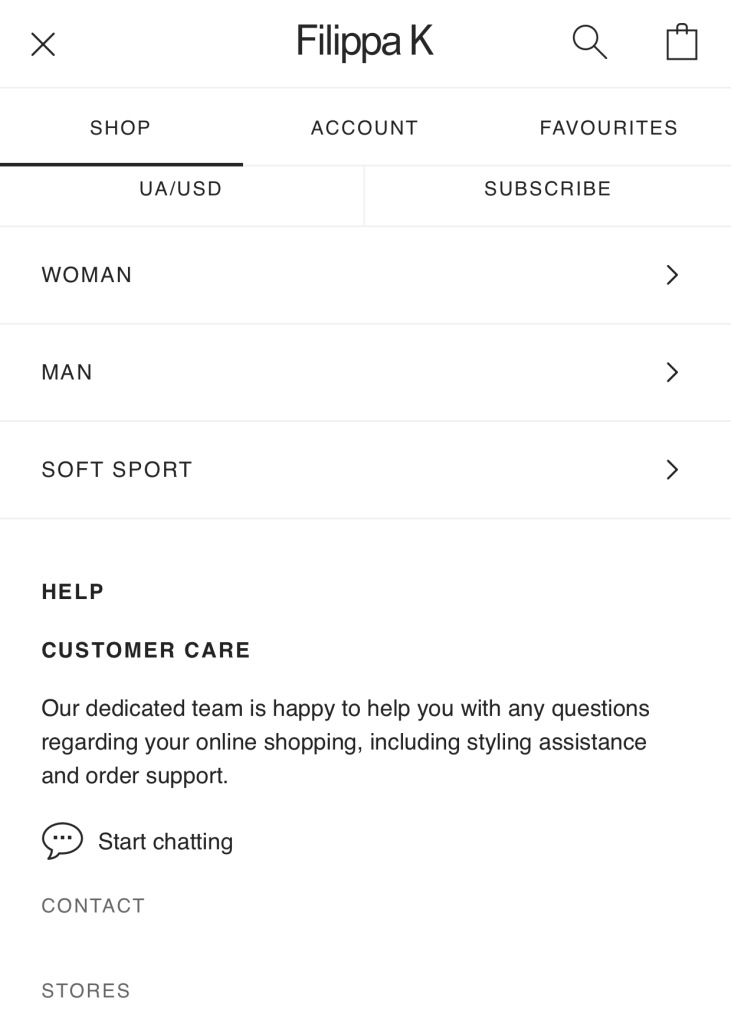
If we take a look at the mobile version, we see that the navigation style is simple and handy. You see all the categories as well as promo information.
The menu is also informative and repeats all the categories that the desktop version has.
If we click on the category, we are lead to the product listing. Filters are at the bottom of the page, which is unusual. They made 2 columns to select from clothing parameters and sort by price, brands, and date of publication.
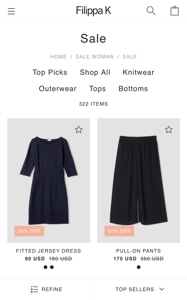
However, the mobile version doesn’t have a quick order feature due to the difficulty of clicking to the small description area.
Below in footer, you have all the site categories that you can choose easily from the list.
The product page provides all the details such as images, description, reviews, related products. It covers everything the customer wants to know before they choose to buy a product at the store.
This page also has one more useful feature, which is called View store availability.
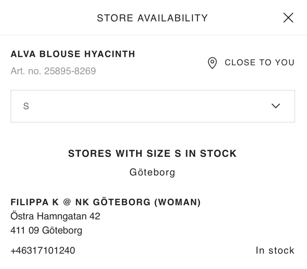
It allows a customer to check the availability not only by size, stores’ name and location, and also they can choose the store which is close to them. This allows for a customer to pick up the product in an offline store, and let you sell products to people that prefer to look at the product and try it on before they buy.
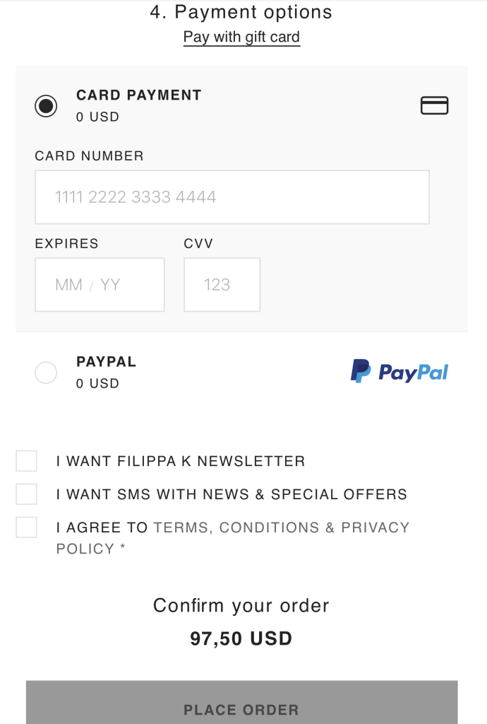
The mobile version also has one step checkout with 3 fields that you need to complete to place the order.
We’ve reviewed all the main features of the Filippa K online store. This strong brand continues to grow not only locally, but also on international markets sharing their mission of mindful consumption and timeless wardrobe. To achieve this goal, they use an online store which perfectly represents their vision, and helps their customers to buy products easily. If you want to grow your business, consider such functionality for your store.
Also, let’s sum up the most important insights from the review for your online business:
- Focus on your brand’s identity. Your brand is unique, and potential customers need to know about it. To give the right message, use your design, colors, vision, logo, and create a perfect design of your website. This will help your customers to distinguish you among others, and also strengthen your store positions on the market.
- Create an omnichannel experience. Connect both online and offline stores by adding necessary features such as availability of the product by location, detailed information about physical places, blog, or a separate page with social initiatives.
- Don’t forget about the cross-selling. You can sell more products by including related items or include others also bought feature to the checkout page. This provides customers with more options to purchase additional products that match their initial choice of items.
- Improve your product page look. Consider using an image slider, add a detailed product description, reviews, and a simple size guide, so your customers can learn everything about the product on one page. Let them feel confident about their choice, and become loyal admirers of your brand.
- Simplify the process of purchase. By adding a quick shop feature, simplify the order placement with one step checkout, you’ll save time for a customer to purchase products and lead them to order more from your store.
Working on the website look and feel isn’t an easy task, however, once your efforts will be rewarded with pleased and happy customers, you’ll be sure that everything that you’ve done before was worth it. We encourage you to showcase your brand in the best possible ways and let people know about the advantages of your store and its products.