We’ve come across the next exciting and sustainable brand that not only fits current consumer tastes but proves itself as a company that helps people choose eco-friendly clothing.
Learn how to deliver the exclusive style of a brand’s products and provide the same price and high quality involving eco-friendly materials by combining it with a perfect marketing strategy.
Weekday is a Swedish brand of denim and fashion clothing. Their story started with an idea formed by four friends. In 2000, they decided to launch their fashion store in the suburbs of Stockholm. Originally, they opened only on weekends: Saturday and Sunday, so they called the store Weekend. However, as the store became more and more popular with its customers, the owners decided to increase the opening hours to seven days a week. So, what happened with the brand name? Simply, they changed it to Weekday. Since then, the brand has expanded by shipping to 88 markets and it has stores in 14 countries.
Weekday was a kind of modern retail shop in the beginning and has since grown into a strong sustainable fashion brand using various creative ways to reach its customers. Weekday offers scandi high street fashion which appeals to young people’s tastes with its styles of modern yet minimalistic clothing.
We will look at what makes Weekday an exceptional brand through an overview of its modern-looking website. You can use this as an example and source of inspiration for your website.
Website Overview

Firstly, what we notice straight away is the set of collections for men and women that are highlighted on the main banner. Also, you can find all the deals and limited collections right from the main page. Quite simple and classy, right?
Underneath you notice the banner with the information about the materials used for crafting its products.
This serves as a strong marketing tool for new customers and tells us more about the brand’s attitude to manufacturing. Also, it highlights its sustainability goals which we will discuss later on in the article.
Let’s move on to a detailed overview of the site’s features and pages.
Easy Category Navigation and Filters to Help Choose the Right Product

In each of our website overviews, we mention that navigation plays a crucial role for customers when they browse a site. This helps to reduce the time for decision-making and to help them find the most relevant products.
Weekday completed this mission 100%: they’ve created banners for each category broken down by the material used, collection, and items on sale. Colorful pictures and styles navigate customers to the right sections.

Filters also save time when searching for the exact product. Weekday has category-specific filters that help customers to specify a search for a certain product via subcategories of color, size, or brand. You can set almost any search criteria that come into mind.

Besides filters, all products have two different views from listing, i.e. the product itself but also what it looks like on a real person. This helps customers to understand how to wear and style the product, and whether it is right for them or not.

Color swatches and the price on the product listing helps to quickly overview all the options regarding the exact product and to make the right decision. We’ve seen such features on different websites before and it is developed even further on Weekday’s website. You can even make a quick color choice without redirection from the product page. Check out how this feature works on the Skims website, the brand owned by Kim Kardashian West. When you have multiple colors of the same product, it’s a good idea to allow color change on the product image without reloading the page.

This ensures that customers can buy quickly and get what they want in less time. Afterward, you can get loyal fans for your brand and subsequently raise sales.
Website Animation to Attract Customers for Purchase
Animation is one of the simplest options to attract customers and get them to stay on the website longer. For example, the scrolling text which is used on the main page of Weekday’s website and also on the product cards looks attractive from a user perspective and makes the page more dynamic.
According to 99designs, animation can bring a brand to life and it also has a positive impact on the overall number of site visitors. People love creativity and interactive elements and any of these could catch their attention, convince them to continue their stay on the website, and lead to purchases.
Simple Checkout to Reduce Cart Abandonment
Weekday has a simple one-step checkout page which is a must for the online store. Customers want to shop quickly and efficiently, that is why by making the checkout as simple as possible, you increase the chance of getting more sales. In most cases, we all like to do routine actions as quickly and simply as possible.

The checkout form is simple to fill out. A customer starts with the first form and then progresses through to the end, a very easy process. The best part of it is that the page doesn’t need to be reloaded, and a customer places their order in just a few clicks.
Print Studio to Make Customers Feel Unique and Creative
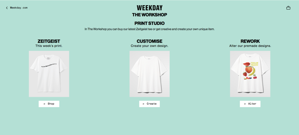
Print Studio (The workshop) is a separate page on the Weekday website that allows customers to feel as though they are creators: customize t-shirts, buy one from the limited collection or redesign premade models.

It is a little bit tricky to find; customers can either get onto the page from the navigation bar by clicking on ‘the workshop’ or from the Zeitgeist page with its limited collection of t-shirts. However, when you get there, you feel like a pro by applying all the different available designs!


The design mode is simple and it lets customers choose the color of their chosen t-shirt, add text, and insert some graphic images. This lets the customer get a unique design or to style their clothes with one of the already available designs.

Here, Weekday customers feel unique and become more loyal to the brand. The bonuses that come with a custom t-shirt are a fixed price and eco-friendly package, which proves the position of Weekday as a sustainable brand. By additional services and rewards, you elevate the customer’s shopping experience and make them feel valuable, stay true to your mission and commitments, and keep coming back to your store.
Sustainable Approach to Manufacturing
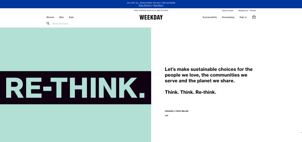
Sustainability underlies the Weekday mission: to help people make sustainable choices. This reflects not only on statements but on the quality and materials used for the production of clothing.

Weekday has a separate page that consists of all the information about their initiatives in sustainable manufacturing. With the long-term goal of becoming 100% climate positive, they have already stepped on this path by creating their denim products from organic cotton in 2015, launched a swimwear collection from recycled waste in 2017, and will continue with the goal to use only recycled or organic cotton from 2020.
Customers can find all the information about the goals and achievements on the Sustainability page. Besides initiatives from Weekday, its customers can be involved in sustainability initiatives by bringing used clothes to any of Weekday’s physical stores and get 10% off their next purchase. It connects customers with the brand, lets them feel like a part of the big idea, and also provides a personal reward.
Among other useful pages relating to their sustainable approach, Weekday teaches how to take care of their clothing created from eco-friendly materials. The information is explained on the Garment Care page.

As a responsible brand, Weekday shows its commitment to covering non-profit organizations’ needs and collaborates with different companies to teach, support, and spread the word about current issues in the world.
The brand’s website and strategy serve as a perfect example for young eco-friendly and youth-oriented brands. We are enjoying this experience and believe that Weekday’s customers feel its care as well. Take the insights learned from this article for your business strategy and keep growing your brand step by step.
Let’s sum up with several tips for online stores:
- Use the latest design trends to keep your site attractive. By following design trends, you will solve two typical issues: website usability and web presentation of your business. Modern designs correspond to a high level of usability and responsiveness, according to the design statistics, and also give you a long-term website look. A functional user interface helps attract site visitors to explore and buy from your store.
- Ensure that your customers know your achievements. Weekday shows that there is nothing better than being honest and transparent in all business processes. Showcase your achievements and initiatives on the separate page and make it clear that you follow them. This way, your customers will be involved in your ideas, and it will ensure a deep connection for customers with the brand. It will also have a positive impact on your sales and business growth.
- Add custom features to highlight your exclusive products and show respect to individuality. Some brands now add custom features to ensure that customers get what they want. For example, a customer can customize a t-shirt online, or measure themselves to get the right products with the AR tool or use live chat with 24 hours support. Make them feel like kings and queens with the personalized shopping experience, and you will get a loyal audience that orders your products regularly.
- Simplify site structure. Simplicity is a key to getting more visits and then, as a result — purchases. By creating a clear site hierarchy and navigation structure, you’ll make your website pages easier to reach for users and search engines.
Improvements to a website can be time-consuming. However, by following the main recommendations regarding website usability, site structure, and design, you can grow your business and ensure its high position in the market. We hope that Weekday’s example will inspire you to keep going with your brand strategy and grow its presence on the web.