As the world is moving towards digital error, a lot of businesses are also striving to go digital. By this, we mean increasing their online presence using various online platforms such as websites.
Having a good website is often a plus since it helps people to find out more information about your business. However, having a basic website won’t cut it out for you. When building a website for your business, you need to put much focus on user experience.
This can be achieved by prioritizing customer engagement and investing more on the usability of the site. This brings us to the next question.
What Is Website Usability?
When it comes to online business, website usability plays a vital role. To have higher conversions, you need to ensure that your website is simple to use. Website usability can be achieved by focusing more on customers and improving each step of interaction with products or information on the store.
This includes easy navigation to enable them to find what they are looking for fast. You also need to ensure that customers will be able to complete several tasks without leaving the site. The effectiveness of your website can be measured by how easy it is to use it. According to Adobe statistics, 38% of people will stop engaging with a website if the content or layout is unattractive.
This is a very crucial factor in online business, especially when it comes to customer interaction. Website usability can, therefore, be described as the act of improving the effectiveness of a website by investing more in user experience.
Benefits of High Website Usability
Businesses that have easy-to-use websites will always enjoy a few more benefits compared to the others. For instance, you will enjoy increased conversion rates.
A good website usability can also help you by minimizing users exit rate. This will instead help you to retain your customers and generate more sales.
Tips to Improve the Usability of a Website
To improve your site’s usability, you need to have a clear understanding of how people are going to use the website. This will help you to come up with a few ideas on how you can help them complete tasks fast within your site. With that said, here are a few tips that can help you get started.
Determine How to Test It
The first step towards achieving good website usability is by finding the best method to use for testing. Below are some tremendous effective methods.
Paper Prototype
This is one of the methods you can use to test your website usability. It is quite cost-effective since you will only need a few pieces of paper for the illustration. This method can be used in the early stages of the project just before the development commences. It is a great method for testing out different concepts.
Field Studies
If you want to receive direct user feedback for your site, this would be the ideal method to use. You can then ask them to take you through the process they use to access information on your website.
You will need to watch them as they complete different tasks as you take notes about the various usability issues you might have noticed.
Eye Tracking or Heatmap
This method will allow you to know the most viewed parts of your website’s pages in a particular order. It uses a color spectrum to indicate these actions.
When you notice a deep color in a particular area, it means the user spent more time in that area than on any other.
It is also an excellent method to determine which parts of your website need to be improved by looking at the less disengaging areas. It can also help you to highlight irrelevant content.
Online Website Survey
You can do a simple online website survey and ask your users directly about their experience on your website.
The method doesn’t cost much since you will be working with a simple questionnaire. When asking questions, don’t be too general or technical. Directly ask specific questions for you to get useful information. For this, you can use Google Forms or Instagram Stories with the poll, tests, or questions that can be placed inside the Story.
Select Tools for Website Usability Testing
After choosing a suitable method, you also need to choose among various tools to work with the site. Below are some commonly used tools for website usability testing.
Hotjar
Hotjar is also among the tools you can use to test the usability of your website. It provides users insights through visuals, and it is fast. The tool is ideal for web designers, product managers, and marketers, as well.
User Zoom
This is another platform you can use for the evaluation of your site’s usability and also the customer experience. You can reach out to their team of experts to help you get more out of your research.
Focus on Your Target Audience
For you to build a useful website, you need to consider the people for which you are making it for. Here are a few ideas you can use.
Improve Internal Search
You should make sure that users will be able to find what they are looking for easily. By improving the internal search, you will be making it easier for your customers to find the information they want within a short time.
Diversify Filter Options
You should also offer your users the freedom to choose their desired items by providing them with a variety of filter options. Using a few specific words might not be enough to bring them the item they want.
This will force them to browse through several items before they can get to the one they want. Try to mix filters with color swatches or adding images of the materials available.
You can also highlight products with categories for special occasions. This will help customers to find specific products faster. See ASOS example:

Optimize Landing, Product and Category Pages
This will help your customers to find your business quickly and learn more about it. Optimizing these pages will bring your business closer to your customer, with every search done. If you make each of these pages detailed and take into account the information the user wants to find at each stage of the buying process then you won’t make them confused and exit from the site.
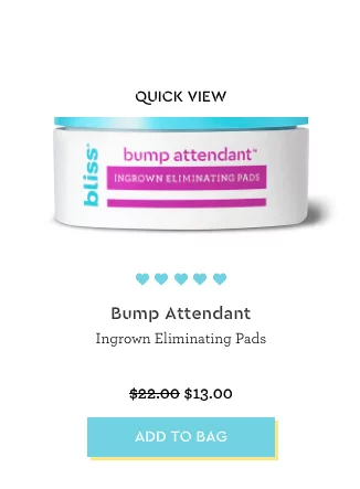
This includes the availability of price and color swatches at the product listing, a wide range of filters for a product search, product information, size and care guide, and also related products. Look at Bliss’s example. Besides a simple product view on the product listing, there is quite a detailed product page with qualitative images, reviews, related products, price, and Add to Cart button.

As you can see, the main point on the listing and product page is the bright and visible image of the product. It will serve as a hook to customers to grab their attention.
Also, some other features will improve the overall user experience.
Allow Guest Purchase
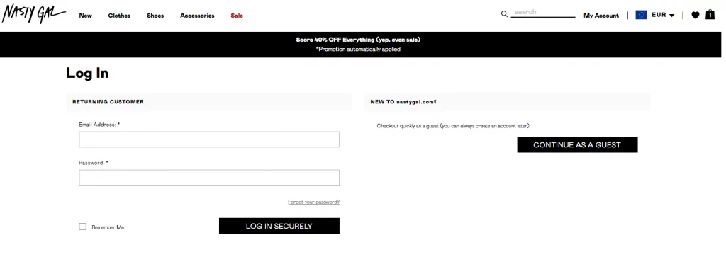
For your site to be quite effective, it would be a nice idea if you allow people to make purchases as guests. Sometimes a user might be interested in the products only and not in the newsletters, and therefore, there’s no need to register or subscribe.
Here is how guest checkout looks like at Nasty Gal store.

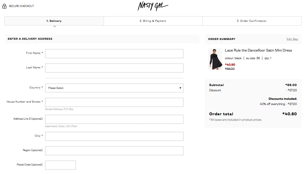
Then a customer is redirected to the checkout page to fill out the information for the order placement.

Once again, the availability of guest checkout will ensure less cart abandonment and an easier order placement process for a customer, which leads to more sales.
Use Short Forms for Offers
When you are running any offers on your site, make sure to use short forms. Using long forms will just discourage users who don’t want to waste any more time to grab the offers. Besides, long forms don’t always look attractive. One of the common options is to showcase offers, returns and delivery information on the Top promo banner. Look at the one from Missguided’s example.

This will ensure that customers will see all the deals and buy more products.
Add More Payment Options
Keep your customers flexible by offering them a variety of options when it comes to payments. When you have limited payment options, you will only attract a certain number of customers who can afford the methods being accepted. Limiting customers is not such a great idea for a business.
Useful for you:
Provide Website Availability and Accessibility
You should ensure that your website is always running and can be accessed at any given time by your customers. You can do the following to achieve this.
First, ensure that all your images have Alt-text, make your content dynamic without page reloading, enable resizable text, keep color scheme recognizable, and overall provide qualitative content.
Check Server Uptime and Broken Links
It is important always to check the server uptime and fixing up any links that might not be working properly. This will ensure smooth operations on your customers’ end and thereby improving the website usability.
Take into Account the Mobile Responsiveness
A lot of people are now using cell phones to access information from various websites. This shows that you have a higher chance of receiving more visitors when you have a website that is more mobile-friendly. If your site cannot adapt to the screen size of various devices, then people will be more likely to exit the site without exploring it all.
Useful for you:
Don’t Forget about Learnability Aspect
You should focus on building a learnable product. This means the users should be able to easily learn how to use the product even on their first time of interaction with it.
Check the Familiarity of Site Features
Always aim to build your website using features that everyone is familiar with. The features shouldn’t be difficult to use even for the people visiting your website for the first time.
Visitors tend to spend much time on websites that are easy-to-use. However, the visit might be cut short when they realize it takes much time to work their way around the features used. Provide customers with understandable icons for major buttons and pages, such as bag, checkout, size guide, wish lists, store locator, etc.
Ensure Evidence Actions
Providing your users with evidence of actions can also help in increasing the effectiveness of your site when it comes to website usability. Users are more likely to remember a particular action when given straightforward evidence of the output it is likely to give.
This will help them in future interactions with your site. For instance, when submitting a form, you are likely to get a pop-up message notifying you that it has been submitted successfully.
You can also receive an error message whenever you try to submit the form with a blank field. Such actions always enable the users to know what is expected of them, the next time they will be filling the form on your site.
Establish Credibility
Credibility is one of the important attributes a business should have. Even if you provide great content, it can be rendered useless if the users don’t have any trust in you. Here are a few things you can do for credibility.
Make Contact Information Accessible
Bring your customers closer by providing them with your contact information. This will allow them to reach you easily with any questions they might be having. When you can answer them in a satisfiable manner, you can be sure of retaining your customers and attract even more.
Display Reviews of Your Products
People are more likely to develop much trust in your content when they see a little bit of evidence. Make sure to include reviews of your products on the website. Let the users know that your products are real and how other users are feeling about them. You can use review platforms like Trustpilot or allow your users to leave reviews right on your website.
Useful for you:
Control Content Relevancy
A lot of people are likely to exit a website quickly when they find out that most of the content posted is irrelevant. Always stick to the course and post only content that is related to the products or services you are offering. This will keep your users more engaged.