Find out how to make your store looking good, and give your customers the best shopping experience with custom features used throughout the whole buyer journey.
The story of this brand begins with one family, kitchen, and dresses. Annie Petterson sewed dresses, and David Petterson worked in a sawmill – a small family business. When The Great Depression hit in 1920, and David’s business had to close, David and his wife Annie joined their talents and efforts to create their small company named Specialized Sewing Factory. The business was growing, their living area was known for textile manufacturing, and it was easy to expand. However, choosing the right product helped to develop such a strong shirt brand.
Next few years, the family business became even more recognized when Annie and David’s sons – Rune and Arne Davidson were traveling around the world in search of new fabrics. The inspiration and new materials were taken from a small town named Eton.
That’s how the brand Eton was expanded to England and got its original name. The history of the brand was highlighted with success and innovations that helped them to stay famous and competitive on the market. After 90 years of work, Swedish brand Eton has grown from a small family business started after the failure to a luxury fashion house with flagship stores in London, New York, Frankfurt, and Stockholm.
But what exactly makes Eton different among other sewing companies?
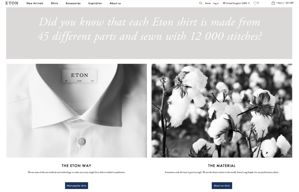
The first reason is experience. Shirts have been crafted for more than 90 years, and have the best materials and techniques used for their production. The company claims to be sustainable, so they are experimenting with Tencel. However, the most famous fiber in production is cotton. Eton uses the best quality of cotton, and some particular types of it to produce their shirts.
Eton also works on optimizing all the production processes, including shirts’ design. The brand collaborates with young artists to create unique printing designs and offers a classic style of shirts like white or blue. These defining features make Eton a famous luxury shirt brand.
However, our first impression was from their online store. It exactly corresponds to the brand’s vision and translates all the values and benefits of it. We’ve checked their site to provide you with a review of their awesome features.
Here is the list of insights that you can use for your brand’s growth and which we’ll look into in this article:
- Tell your brand’s story. The best place to present your brand’s values, mission, and build strong relationships with your customers is your website. You can do it by creating the About Us page, highlighting your key advantages, and other marketing pages to gain customers’ loyalty.
- Lead your customers to the purchase. You can use banners on the homepage to show your best products or deals, or create specific categories to help customers choose products for special occasions. Also, additional guides on how to use your product or brand-related stories will help customers choose the desired product faster, which leads to more sales.
- Organize a comfortable shopping experience. Convenience and clear navigation are what a customer wants from the store. That is why a detailed description of the product, additional blocks for various product types, sizes, and related products will help you to sell more products. Adding reviews, care guide, and informational pages as FAQ, Delivery, and Returns pages will help to clarify all the working processes for customers and makes them feel confident about their choice.
- Add some entertaining details. Eton has beautiful and informative pages for clients to make them want to purchase their product (we’ll see it below). This can be some inspiration on how to dress, style, or use your product, the story of your brand or featured products, product details with a description, and another kind of informational pages. Anything clickable or moving and animated will be interesting to look at. You can add video or animation to the pages, and blocks that are hidden in the product images or banners.
Let’s continue with an overview of the website and see HOW and WHY Eton’s website features can be useful for your business. You can use these insights to improve the user experience at your store and increase your sales.
Website Overview
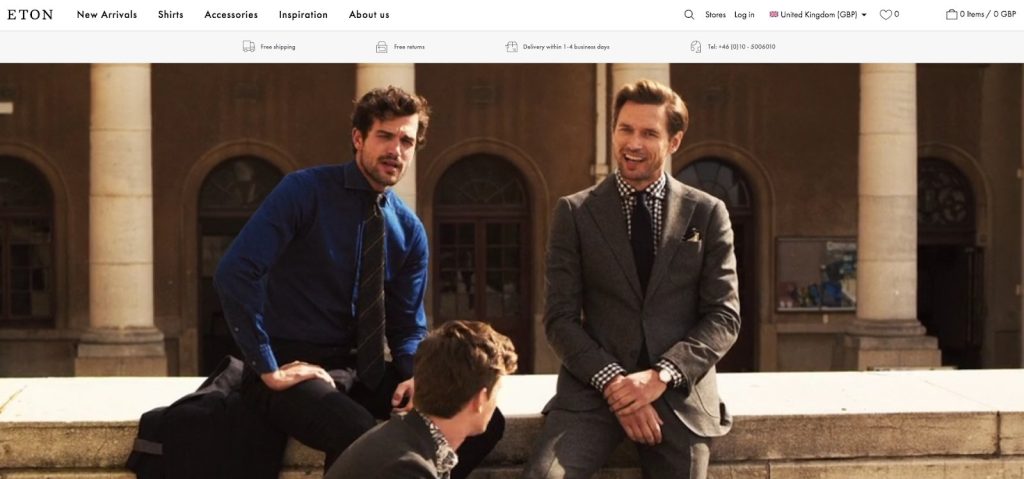
When you get to the main page, first you see the video with 3 men wearing shirts from the latest collection. The whole website is telling a story about the brand, the quality of their shirts, transparency of business processes, and make you feel like a part of a luxury men’s club. Colors of the website are calm, and at the same time, the design is transferring the confidence of this brand.
If we will look at the brand, and how it translates their vision of the product through the website, we’ll see that a product is not just a plain shirt. It is a part of the look, a unique experience with long-lasting quality, and for special occasions. With this in mind, we’ll check the most interesting features and pages that the Eton team has created for their customers, providing them with the best user experience.
Now, let’s consider each part of the website in detail.
Top Useful Features of the Store
Eton store has convenient navigation with lots of categories for different occasions. Let’s review the desktop version of the store.
Key Benefits on the Main Page to Catch Attention & Show Value
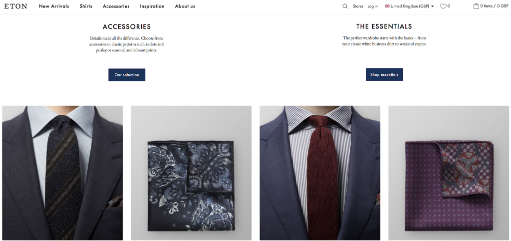
The sections with various categories on the main page are showcasing all the important collections and products. This is great because any person who visits the store can easily buy any product. The header also has a selection of currencies, customer account, cart, and favorites, which is convenient for a customer to browse and buy freely.
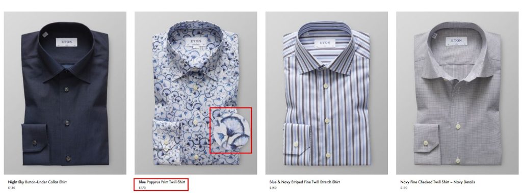
High-Quality Resized Images to Showcase the Products
A customer gets the resized image of the print. It is very convenient, as the size of the image tends to be small, especially on mobile. In this case, you can reach more customers with a clear view of each product they buy. Also, this helps to showcase the quality of each fabric and to prove the quality of the shirts.
Categories for Various Occasions to Increase Sales
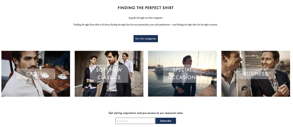
As we’ve already mentioned, Eton has created various categories to help its customers find the right product. It’s a great idea because people tend to choose clothes for the occasion, and they will likely buy several products if they go well with each other.
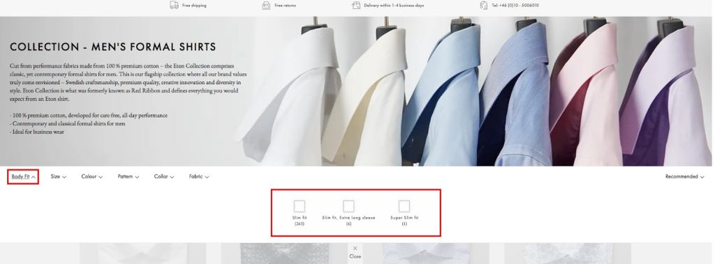
Product filters show all the different styles, patterns, fabrics, and collars, so a customer sees the whole range of the products. It is helpful for customers in terms of narrowing down the choices. With these filters, they are able to choose the exact product they want.
Care Guide to Reduce Customers Anxiety
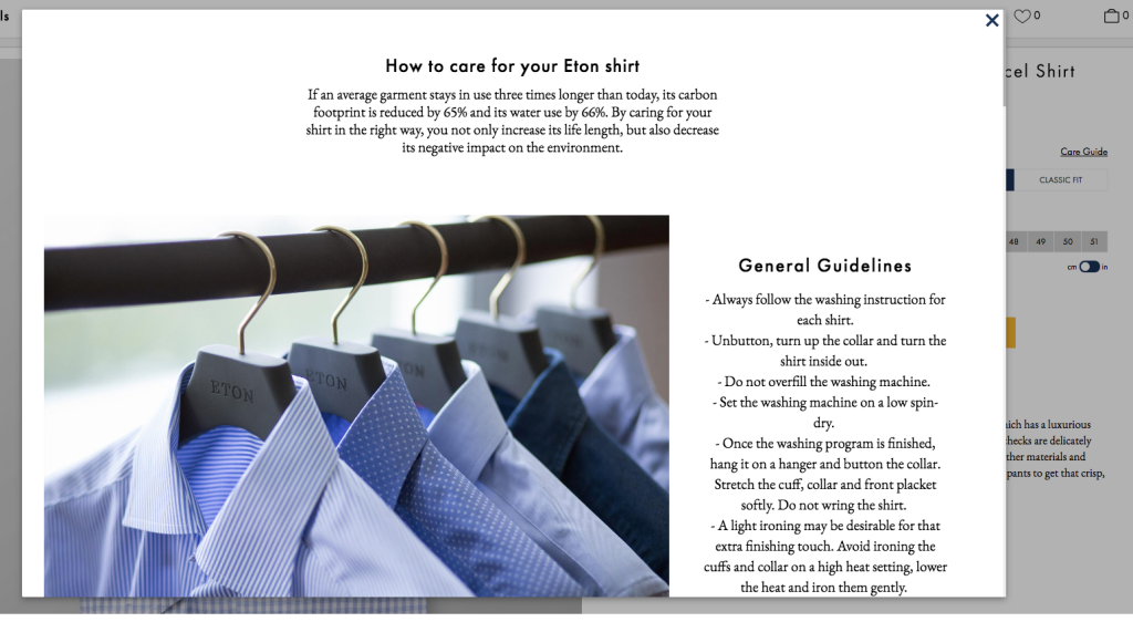
The product page has lots of unique features made for customers. For example, you have a care guide which opens in a pop-up and has a detailed description of how to take care of the shirt. This helps to learn all the information regarding the product, and avoid unawareness regarding the quality after washing it.
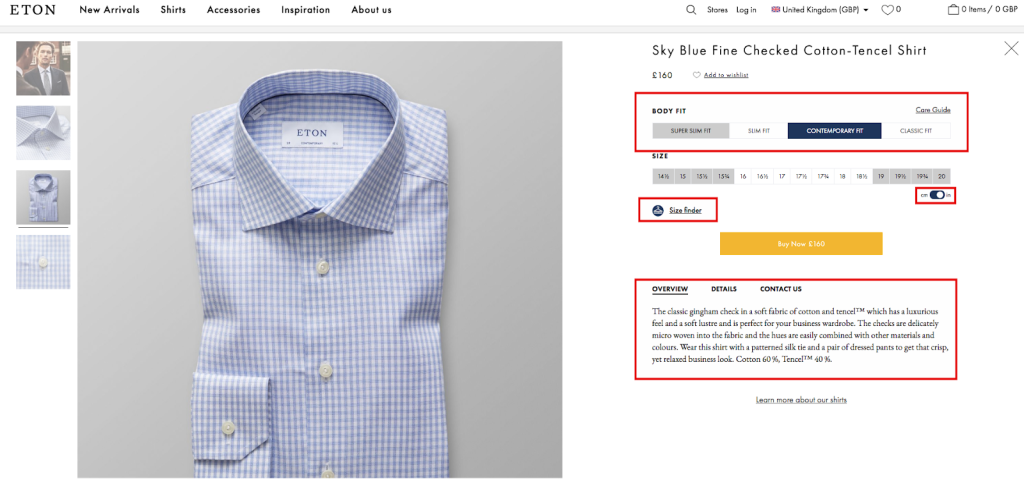
Also, a customer can choose one of the fit types for your preference: slim or classic, or another.
User-Friendly Product Card to Motivate Purchase
The overview and details of the product are written in short with the most important information regarding the material, style, and product care. The page includes fit finder, which helps to define the size of the product based on your data. This feature is helpful for those customers who tend to get worried about the wrong size and possible returns, and overall add more engagement in the buying process.
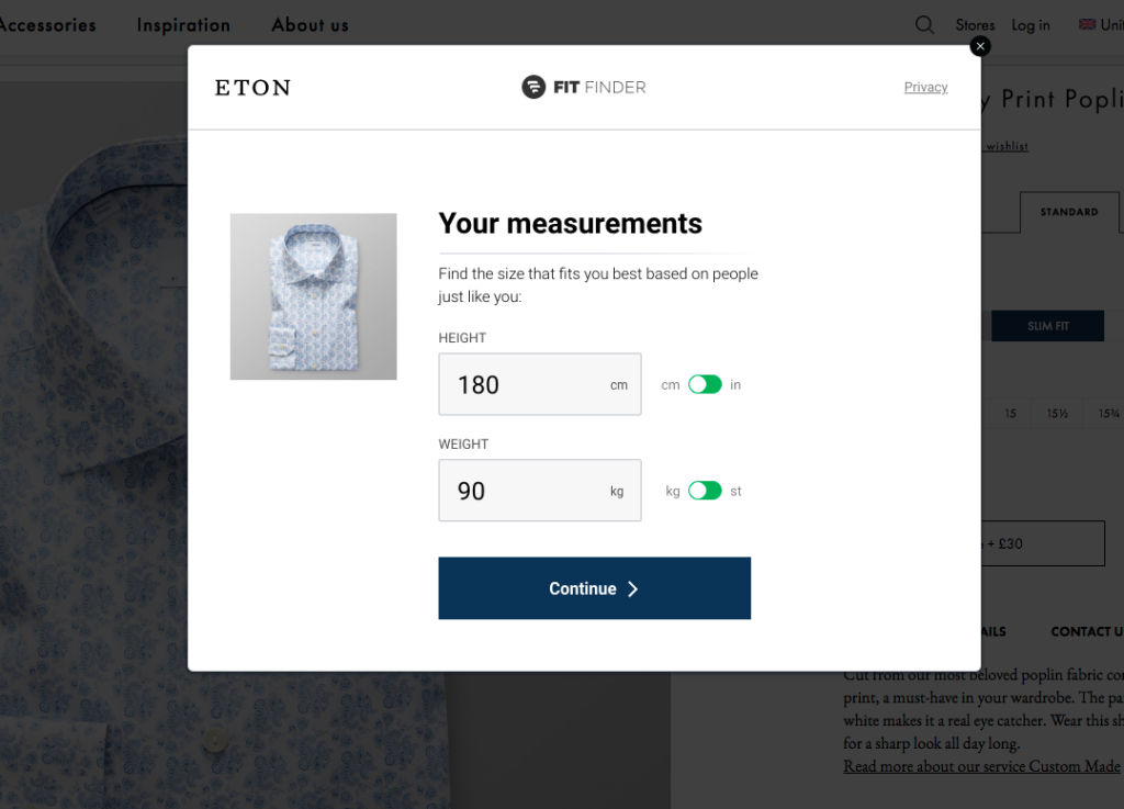
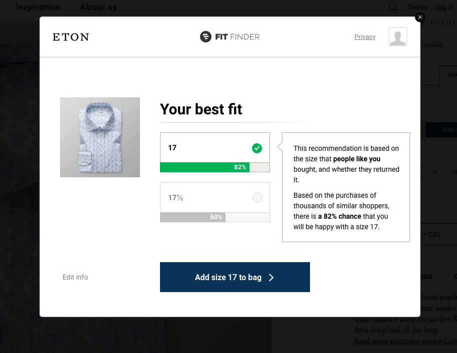
Detailed Size Guide to Keep Customer Entertained
If a customer wants to know how to find the right fit for the specific shirt, Eton has the page called Size Guide with all the sizes, and instructions on how to choose the right one.
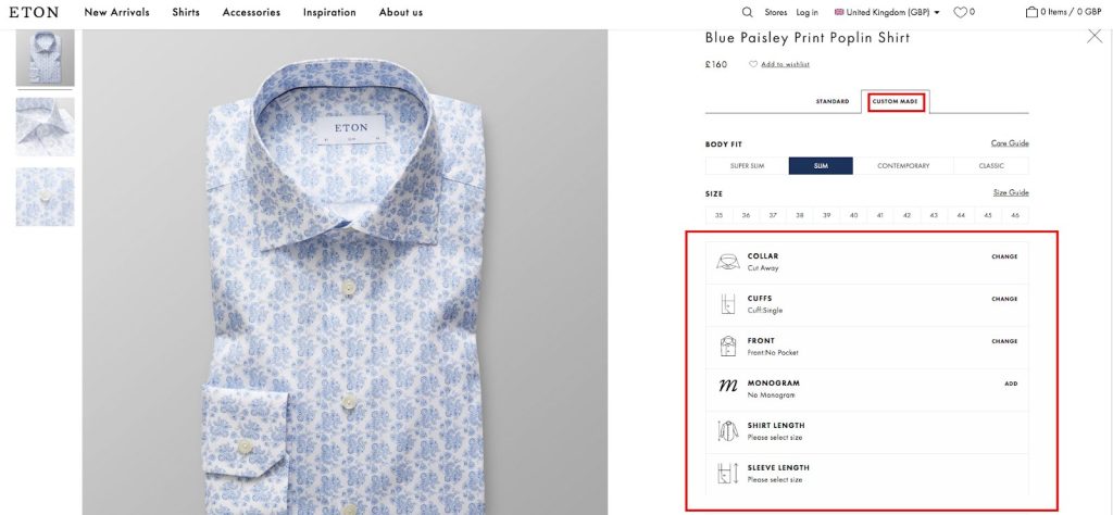
The next unique feature that Eton turned into their unique proposition is a customization of the shirt on the product page. A person can select what to change in the basic option, and it will cost £30. This includes the collar, cuffs, and front. They can also add a monogram, change the length of the shirt and sleeves. The benefit for customers is a custom-designed shirt which makes them feel special and unique. Plus a custom made products cost more, and customers tend to pay more for the additional services without any doubts.
Simple Checkout Process for Smooth and Impulse Purchases
Eton has one page to fill out the customer’s information. This is much more convenient than having 2-3 pages; however, it requires some time to fill out the data which could cause difficulty for some customers.
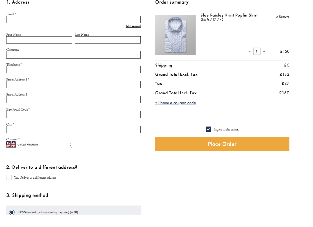
According to Neil Patel, the abandonment rate happens at the first step of checkout because of the “sign-in” barrier. If you’ll simplify the checkout process, place fields in the right order (first should be the address than shipping, and last is billing not to frustrate customers with the payment right away). If your checkout is done right, the conversion rate can increase up to 5%.
Great Marketing Pages to Convince the Customers
Next part was the most pleasant to review. This includes Inspiration, Sustainability, and About Us page. They bring the value of the brand, reduce anxieties, and let customers having a desire to get their products.
Other pages are helpful in terms of customer care and service. They give information about the product, entertain, and interact with a customer directly. The information pages of Eton site such as “About Us” and “Care Guide” created for customers with care. They cover all the questions that might occur regarding the product, manufacturing, and other customer-related answers.
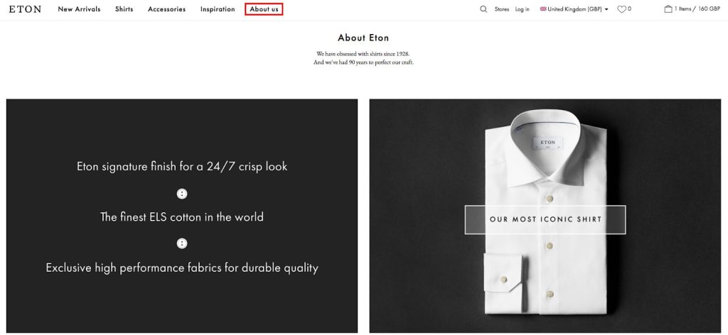
Pages look great and give the customer a good feeling about Eton products even before they purchase anything.
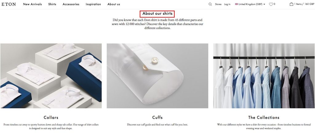
Informational Pages to Show Brand Purpose and Impact
Informational pages, such as Sustainability, cover questions of responsibility of the company in the manufacturing and delivery of the products.
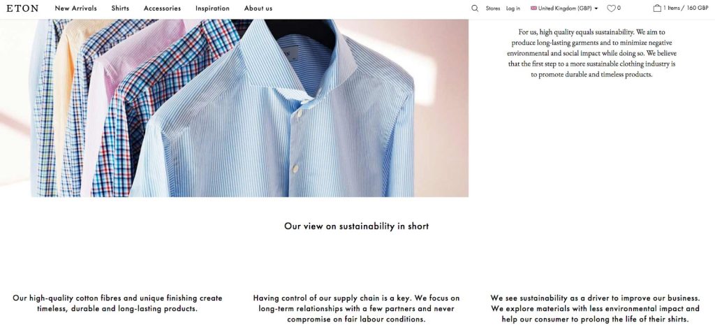
They also provide Sustainability reports, and Code of Conduct, which means that Eton is a part of certified companies in a list of world-leading sustainable organizations. Any eligible or international certificates and awards will show the expertise and the quality of products/services of the company. That’s why it is better to highlight the awards of your company in the footer.
Useful for you:
Instead of the Conclusion
As you can see, Eton e-store is an excellent example of a user-friendly website, and the brand itself is a real hero of a fantastic success story. We were impressed with how Eton founders have overcome all failures and barriers rising their new successful star, which is now one of the TOP Swedish fashion brands. You see that everything is possible if you are committed to your idea and ready to be flexible in your strategy.
We’ve made an overview of Eton store features. It was a pleasure because this store for men has a protruding portion of aesthetics and care which couldn’t leave customers unconcerned.
We know how important it is to keep customers satisfied. That’s why we encourage you to use various features to make your site look great and develop your brand to be outstanding. Try UX tips from this guide, and you’ll see how your sales increase.
