
Here is another review of the successful clothing store with a creative background. With Stutterheim’s example, you’ll see how one small idea can grow into a strong and successful brand. We’ll explore their website and highlight the best features that help to get its act together and attract more customers.
Stutterheim is a Swedish company with genuine creativity on melancholy and perfect raincoats. As well as their high-quality rain clothes, the brand has a rich background.
Stutterheim’s story began with the fisherman’s coat that was found on a rainy day. The creative director, Alexander Stutterheim, found his grandfather’s old raincoat, and he noticed that Swedes didn’t have any proper clothing for rainy days. So, he decided to redesign that raincoat into a modern version. That’s where the successful journey of this brand began.
Working on new raincoats, Alexander Stutterheim and his friend, marketing director, and co-founder, Johan Loman, found a unique meaning of melancholy, and it has fundamentally changed the relation to this term. Now, the story about the grandfather’s coat, melancholy, and creativity is combined into a strong brand of Swedish raincoats.
After you realize the brand’s story, concept, and values, you will find out how they develop the store. This guide will help you to choose the useful features for your online clothing store and improve user-experience by following the example of the Stutterheim brand. We also want to share our latest interview with Stutterheim’s CEO, Peter Bergkrantz on brand growth and development online, which is a great addition to the article. This will give you the full picture of the brand, their values, and why it is successful on the market.
We’ll begin with a desktop site version and then continue with the website appearance on the mobile version. This will guide you through the idea of how the company manages their online store. Let’s move on to the review.
Company’s Site Overview
When you first enter the home page, perhaps, you expect to see some dark colors, strict design, and a rainy mood. Instead, you get a colorful banner that tells you about the summer sale and connects you with the colors of the latest collections. Below you get shipping information, bestsellers pieces, and some main store categories, which make it easy for a customer to go to the product listing.

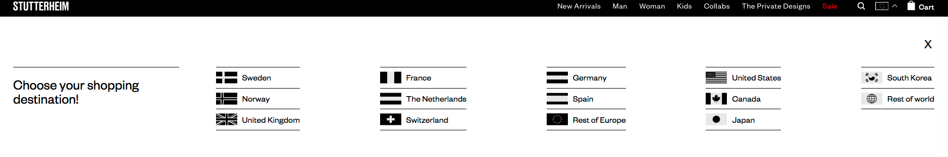
The design is very stylish and follows the melancholic philosophy of the brand. If you click on the multistore selection, you see the flags in black&white colors, which is pretty cool and again follows the brand’s style.
Functionality Analysis
The website has a common store features as:
We’ve started with a short list of the main Stutterheim features. Let’s move on to the detailed overview and consider which functionality is essential for online clothing store on desktop and mobile.
Desktop
Home Page & Navigation
When you enter the main page, first, you see that the store has main categories and some featured collections named Collabs and Private Designs. Except for their iconic Arholma coat, customers can now choose shoes, hats, thermal liners, knitwear, and accessories.
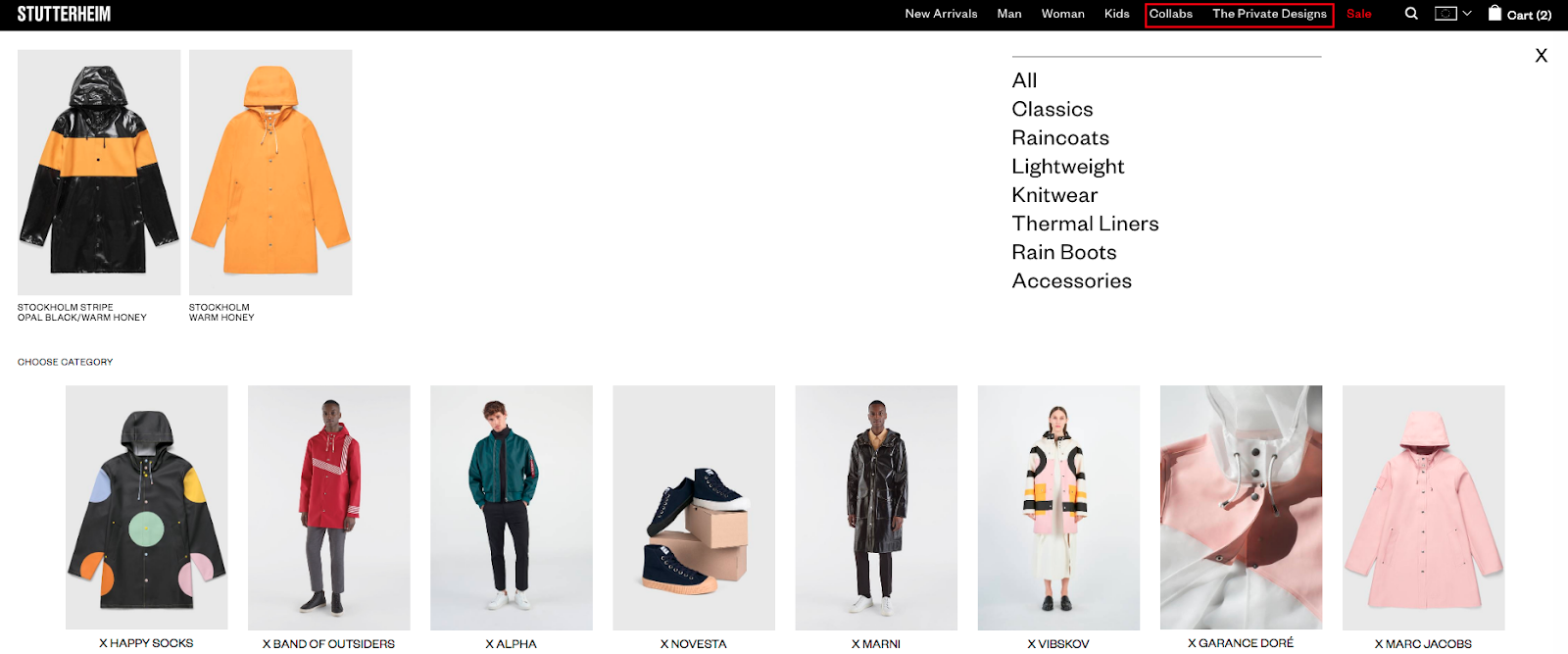
We mentioned featured sections because it is a great way to present your customers with some custom products, make them feel unique. Increase brand awareness through cooperation with famous companies, influencers, and other famous people when creating new collections. This will also lead your customers to get more items from your store and overall sales increase.
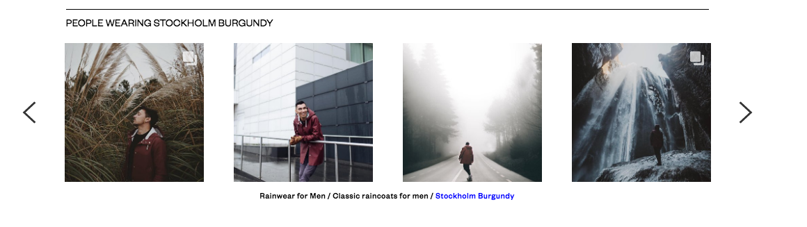
Among other features presented on the main page is the Instagram block.
If you click on a picture, you go to the #Stutterheim page, where you’ll see Instagram pictures with customers wearing Stutterheim clothing. The process is simple: a customer posts the Instagram picture and adds a hashtag featuring Stutterheim, and then it automatically appears on the main page of the website. It is a useful add-on that lets a customer get the desired look in a single click. Also, it is an excellent channel for promotion, and it gives an overview of how the product looks on a real person.
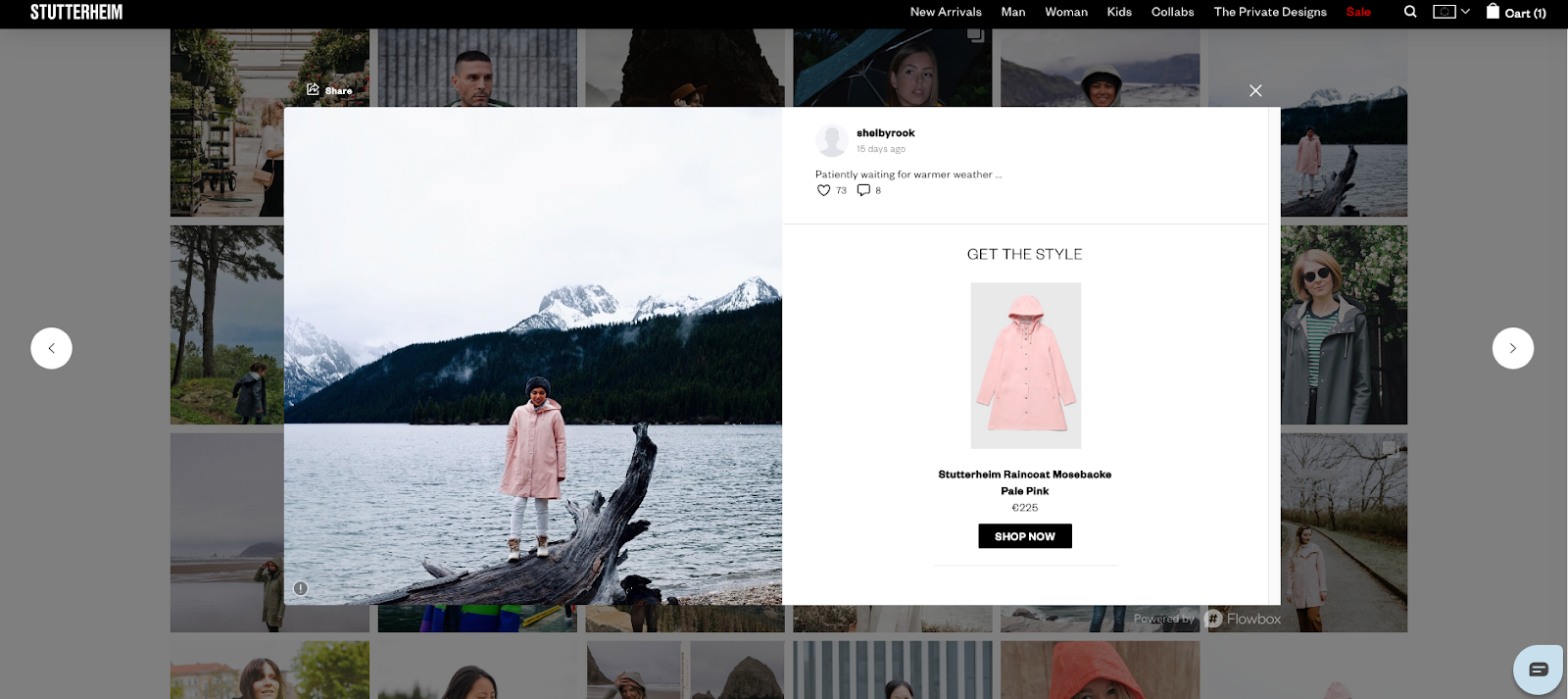
Also, you can find the same block on the bottom of the product page. Customers can look at the product worn by a real person.
Product and Category Pages
Each category has simple navigation by sections, as well as a filter with a small range of options. Filters are accessible, and you can choose any parameter from the 1st section, which doesn’t distract a user from the product search.
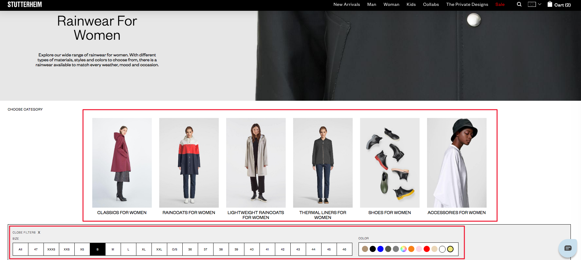
After a user chooses the product from listing, they go to the product page. Each product page has Images, Size Chart, Size Guide (with Virtual Fit Guide), Add to Cart button, Description, Shipping, and Returns, You May Also Like, and People Wear.
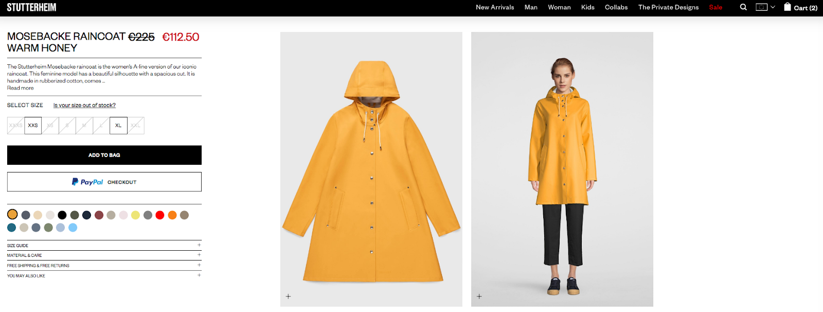
Sections presented in a dropdown menu save space on the page. Resizing the pictures helps a customer to look at the product from different angles. As for the size selection, it is performed in a simple way allowing a customer to see which sizes are available. Particular sizes of items that are out-of-stock are crossed and highlighted with a lighter color, which helps a customer to see only available sizes of the specific product.
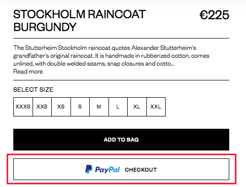
If we look at the special features on this page, definitely PayPal Checkout and Virtual Fit Guide elevate the shopping experience to a high level.
PayPal Smart Payment Button allows a customer to pay orders through the PayPal account and place it in one click. This feature cuts off the time for the order placement and lets a customer save their time.
Virtual Fit Guide allows the customer to check how the clothing fits them based on their parameters. You write width, height, and other data, then the tool shows you the store clothing parameters and compares it to yours, giving some general recommendations regarding your choice.
Checkout Page
The checkout page needs to be easy to use. In Stutterheim’s case, the checkout opens on the same page so that the user can see their cart immediately. This is one of the most popular types of checkout, and it doesn’t distract a user from the purchase.
Let’s see how it works. A customer adds some products to the cart. After that, they get a side pop-up with items added and can proceed to checkout.
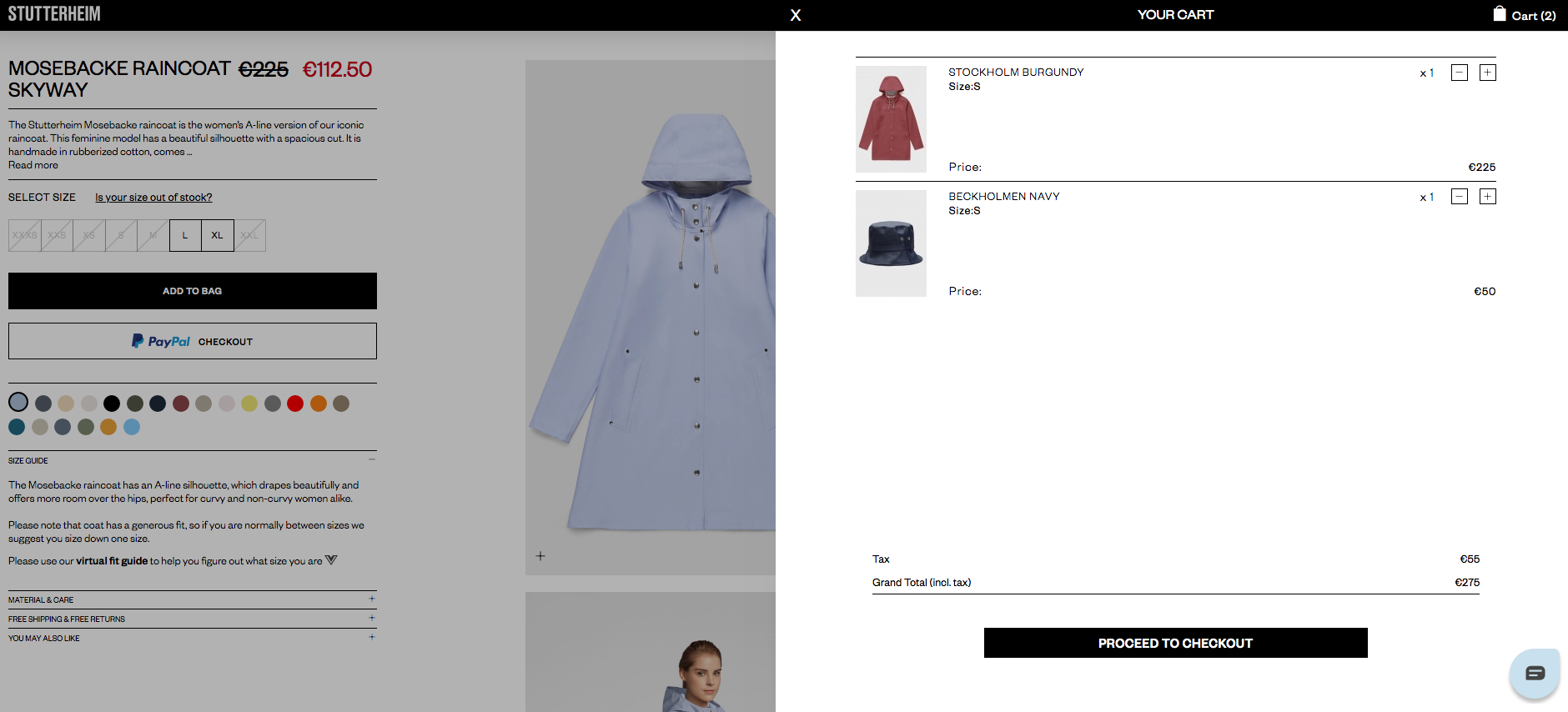
If someone chooses to proceed to the checkout instead of fast PayPal Checkout, they need to fill out the contact information and then pay with a credit card or PayPal once again. Then a customer places the order and waits for the email with details.
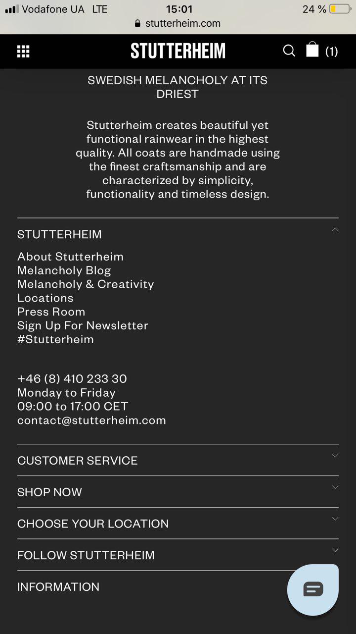
Marketing Pages
The informational part of the site includes a Blog, an Instagram block, and an Our Story page. They help to involve a customer into the history of the brand, allowing more touchpoints while browsing the store.
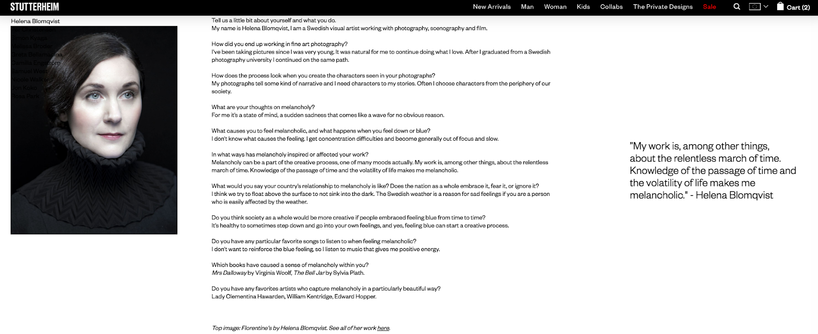
One of the best ways to present the brand’s uniqueness is to create some story or associate your brand with some concept to have a strong position in people’s minds. That’s why Stutterheim decided to connect the brand with a Melancholy term. Instead of its original meaning, they made melancholy a part of their creative strategy and highlighted talented people talking about melancholy and art in small interviews.
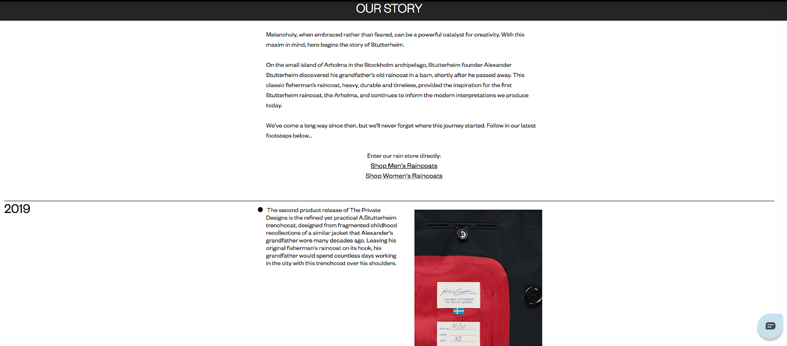
If the brand features their background and highlights the key dates on one page, it will work for the increase of brand awareness. That’s what Stutterheim did in presenting their history with a detailed description of each stage.
As far as we can see, the desktop version of the website is convenient for the website user and helps to communicate brand vision and values.
What about mobile visitors?
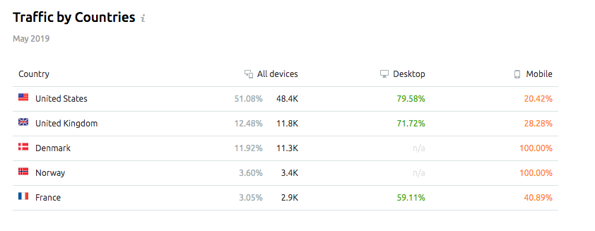
Do you know that mobile devices make up about 23% of overall eCommerce website traffic?
What about the Stutterheim stats? According to Semrush, mobile traffic consists of 37% of the total traffic, which mostly comes from the United States. Scandinavian users visit the website only using mobile devices.
Let’s move on to the Mobile site version and see how well the Stutterheim brand takes care of their mobile visitors and what helps them to convert their website visitors into loyal customers.
Mobile
The mobile version is well-optimized and easy-to-browse. The main page repeats the desktop version. The mobile hamburger menu guides you to the categories, which is convenient and easy to click on the smartphone.
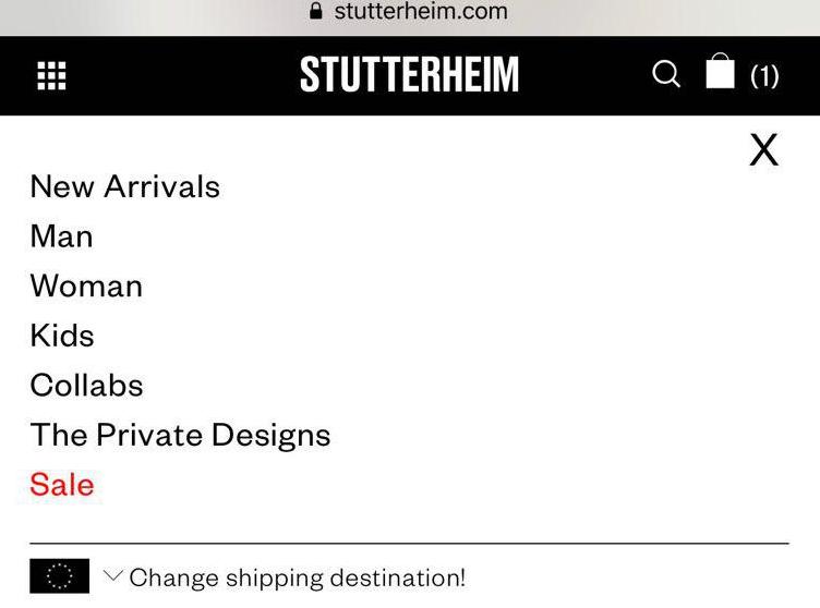
Below in footer, there is a dropdown menu with all site categories. It is convenient in case you have lots of essential pages that you want to highlight.
Category and Product pages are also simple to browse, which makes the mobile version completely user-friendly.
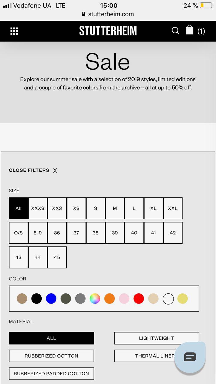
You can apply any filters by size, color, and material. The product page also has all the descriptions, Size Guide, Add to Cart, Virtual Size app, Swatches, PayPal Checkout, and Shipping information. It is easy-to-click on each line, and overall, the information is accessible.
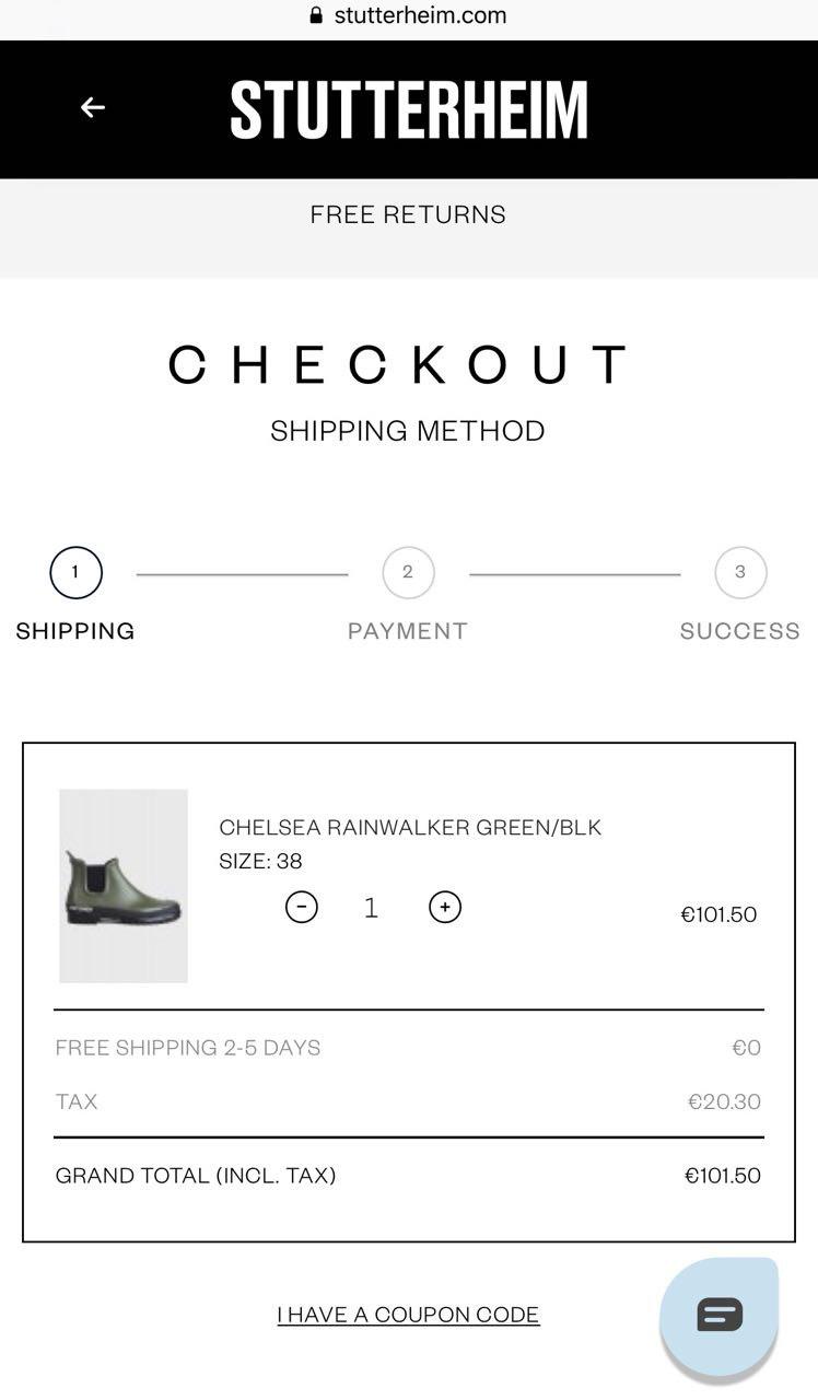
The mobile version also has a two-step checkout and splits total to a tax and a total sum. Also, the store offers free shipping and returns, which is appreciated by customers. Such a simple checkout with price highlights lets a customer be aware of their total payment. That makes them confident about their purchase, and let them return to your store again.
So, we’ve considered the main aspects of the online store. Stutterheim has created great products for rainy days, and fully functional website that makes a shopping experience a pleasant thing. If you wanted to find a great example for your future store, consider such features and structure from this brand’s website.
Here we want to place the main highlights and tips from this review for your business:
- Communicate your brand’s positioning. Tell the story of your brand using creative storytelling and highlight your exception on the About us page. Communicate your brand’s value through your mission, goals, and visual design. Be honest, sincere, and authentic to have a place in people’s minds.
- Use the power of social media. Highlight your customers’ publications via their Instagram on a separate page. Let others see how great and accessible your products are, and how they look on real people. Involve some influencers, and other brands, and create new collections with them to reach a wider audience.
- Make clear website navigation. To simplify your site navigation, you can start with making a clear menu with minimum categories, including important pages, and optimize filters with relevant parts such as size, color, material, and product type. Overall think about every step of the customer’s interaction with your store, which means the accessibility of pages for a customer.
- Improve your site search. Besides a regular search that should be included in all website pages, you can upgrade it with a plugin that allows you to have autosuggestions and autocomplete, which will simplify the search and save time for a customer to find the exact product.
- Increase the accessibility of each page. Information related to the product, payment, shipping, and delivery is essential if you want your customers to complete their purchase and come back to your store again and again. All the necessary pages should be visible and reached in two or three clicks. You can use the sidebar for each page to help customers reach them quickly.
- Realize your business goals with the store’s features. Include CTA buttons below the product. Place all the current offerings on main banners, and the menu so the customer can check them quickly. This also includes each feature that will help you to reach your customers, such as sending newsletters and reminders for the abandoned carts, related products, and you may also like block and simple search.
- Simplify search of the size. Implement Virtusize fitting solution into your size guide, and help customers to define their size easier.
- Provide various payment options. Use PayPal Checkout to simplify order placement for your customers. Also, don’t forget about the security level.
- Let your customers feel secure and valuable. Add live chat, and reCAPTCHA, so customers will see that the store is safe, and the team is supportive. Also, include the store locator, detailed description of each office, and store. This helps to connect customers with local stores and allow them to buy offline, which means improvement of the omnichannel experience
- Optimize the buying process. Cart and checkout should have clickable products, the ability to add any product quantity, plain fill out the form with autocomplete, and order confirmation as a pop-up, and email notification. When a customer adds any product to cart, you may include the feature Others also buy on the product page or at the cart page, so the customer gets a chance to buy more products, and you’ll get more sales.
Now you can use some insights and features for your store to elevate it to the new level.
The fashion industry is growing; the competitive market is also developing. However, any brand with a great idea and story has their opportunity to gain the trust and love of their customers and go skyrocket. You can build your brand and take care of the convenience of your website visitors; improve the user experience at your store, and let your business continuously grow and strengthen positions on the market, as the Stutterheim did.